Inspiration
Subscribe to
our newsletter
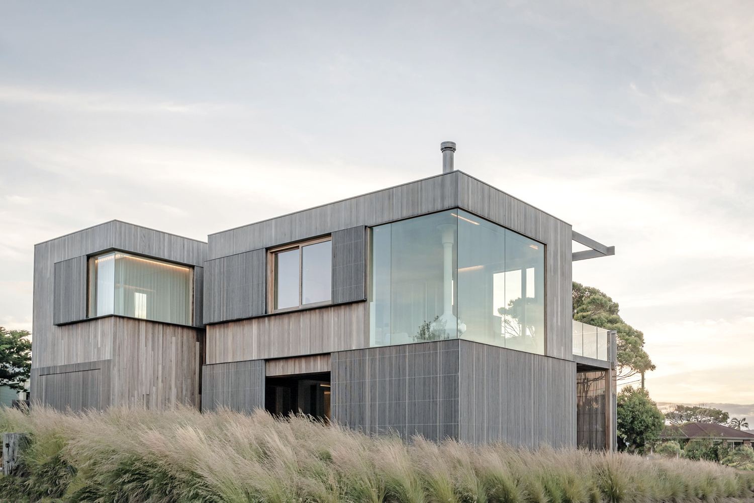
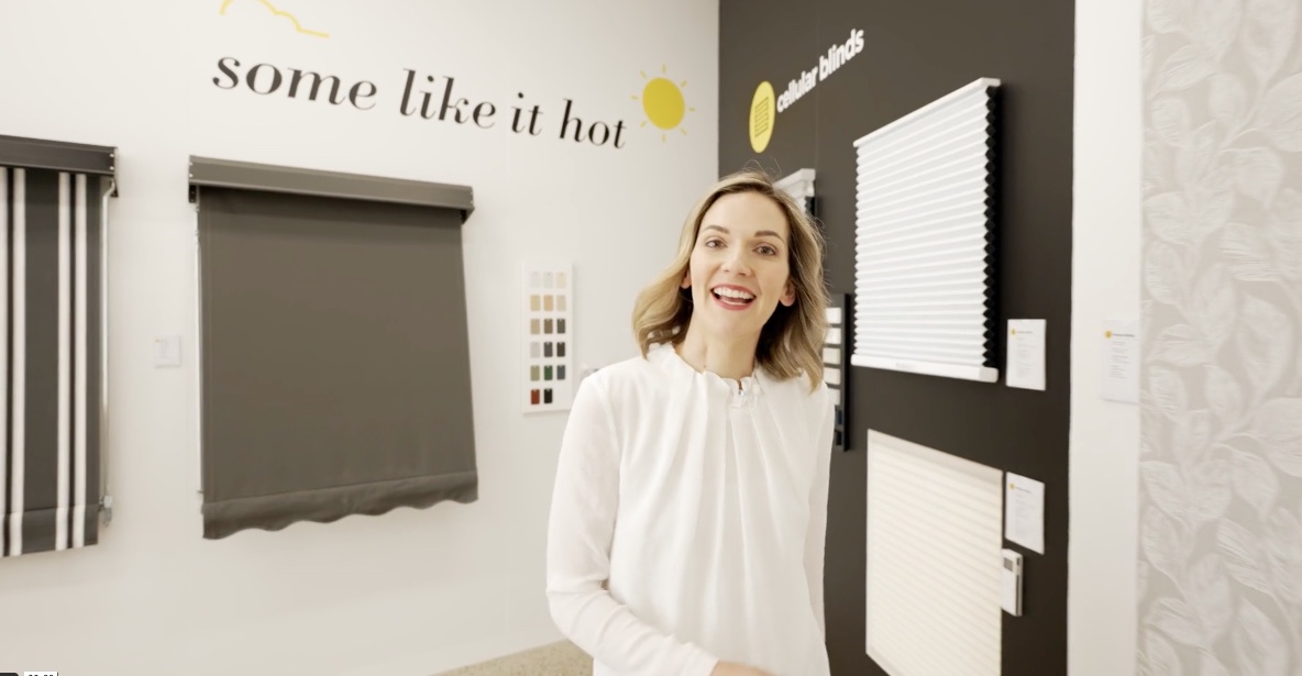
What Are Honeycomb Blinds? A Complete Guide to Cellular Blinds.
Discover everything you need to know about Honeycomb Blinds in our complete guide. Learn how they work, their energy efficient benefits, different styles, and why they’re a top choice for insulation.

New product – Automate® Pulse PRO.
Experience next-gen smart window control with our all-new Automate® Pulse PRO — now with stronger signal, easier setup, and Matter compatibility for seamless convenience.
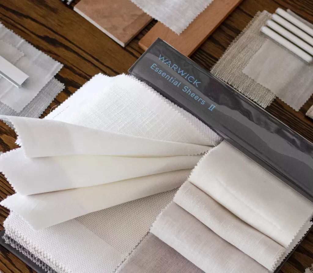
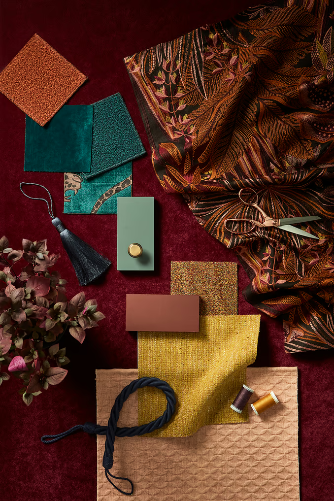
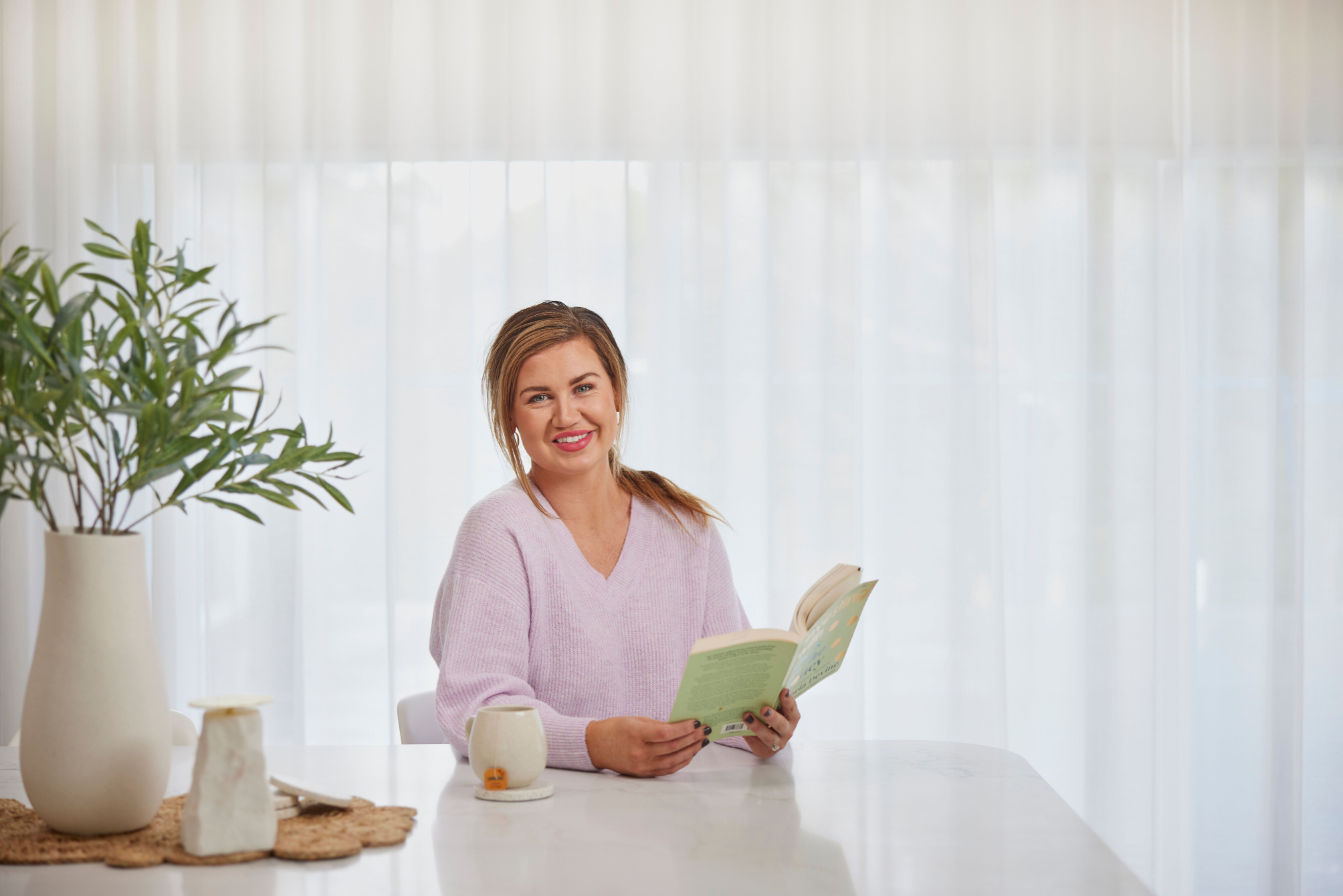
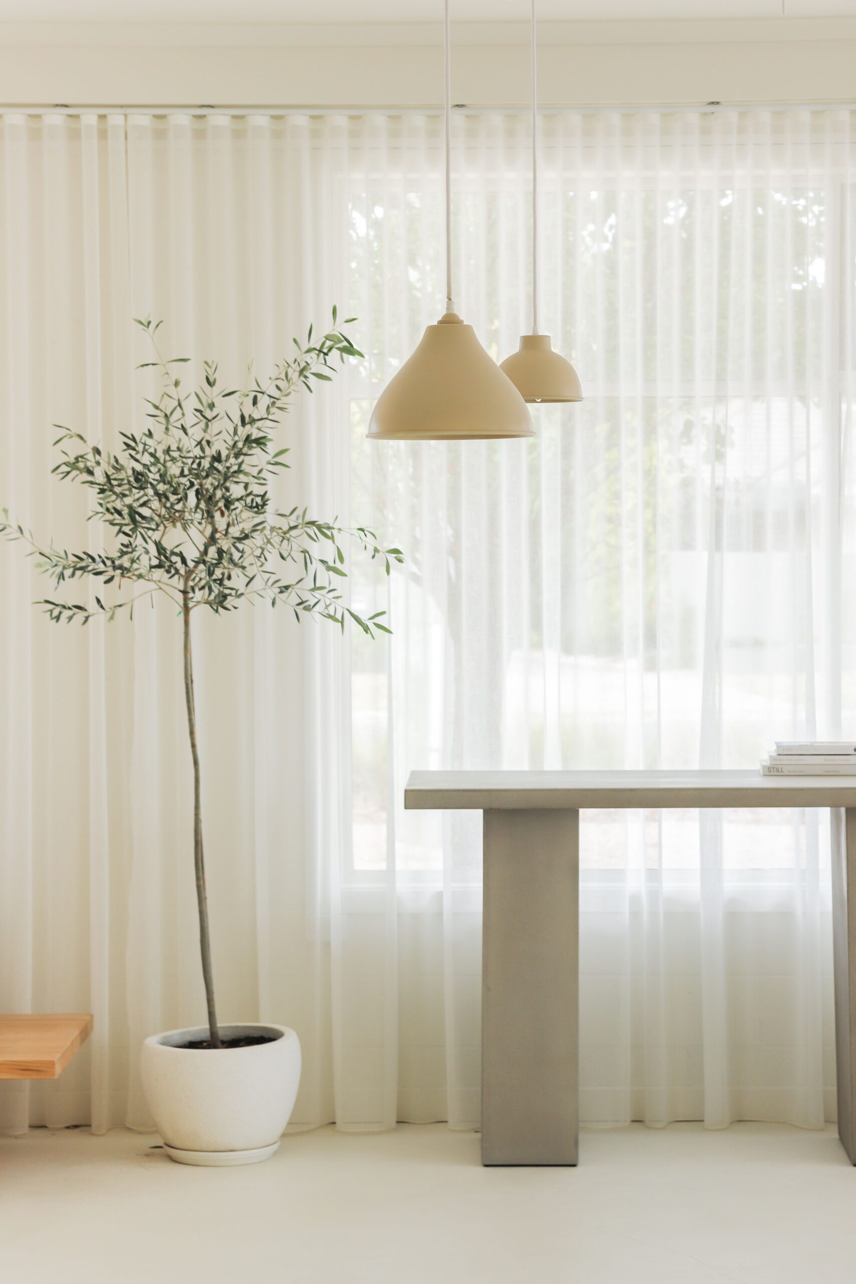
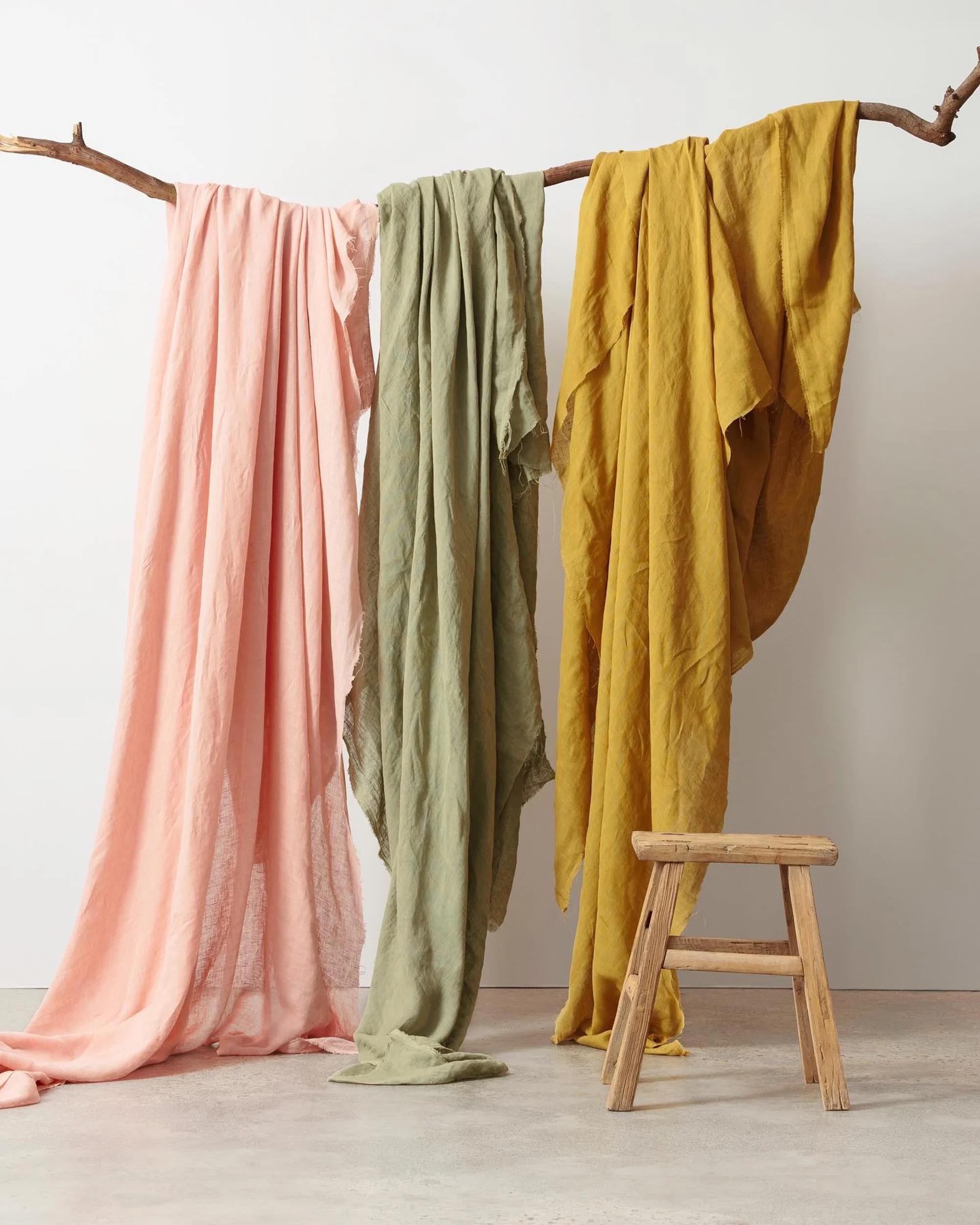
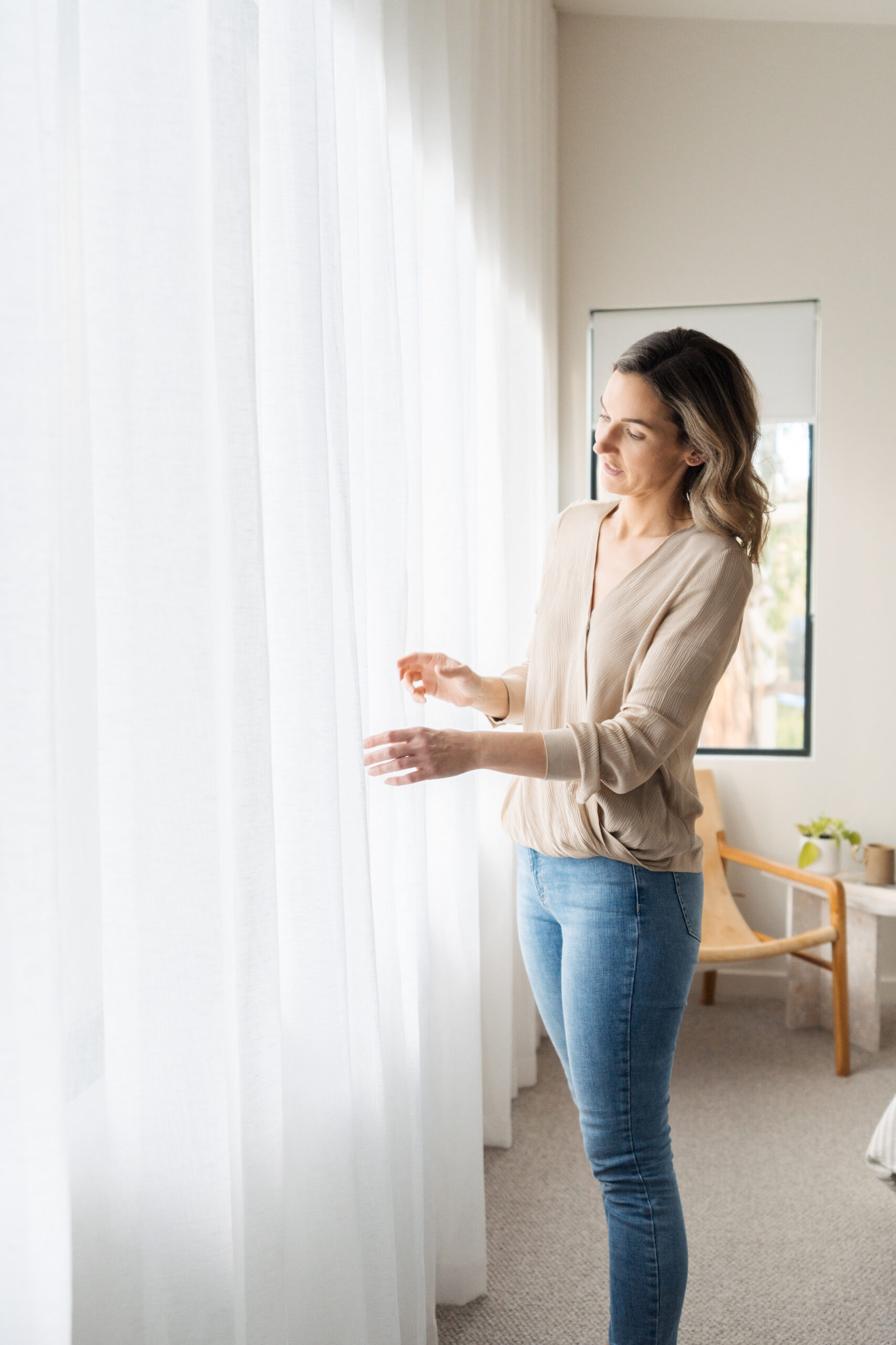
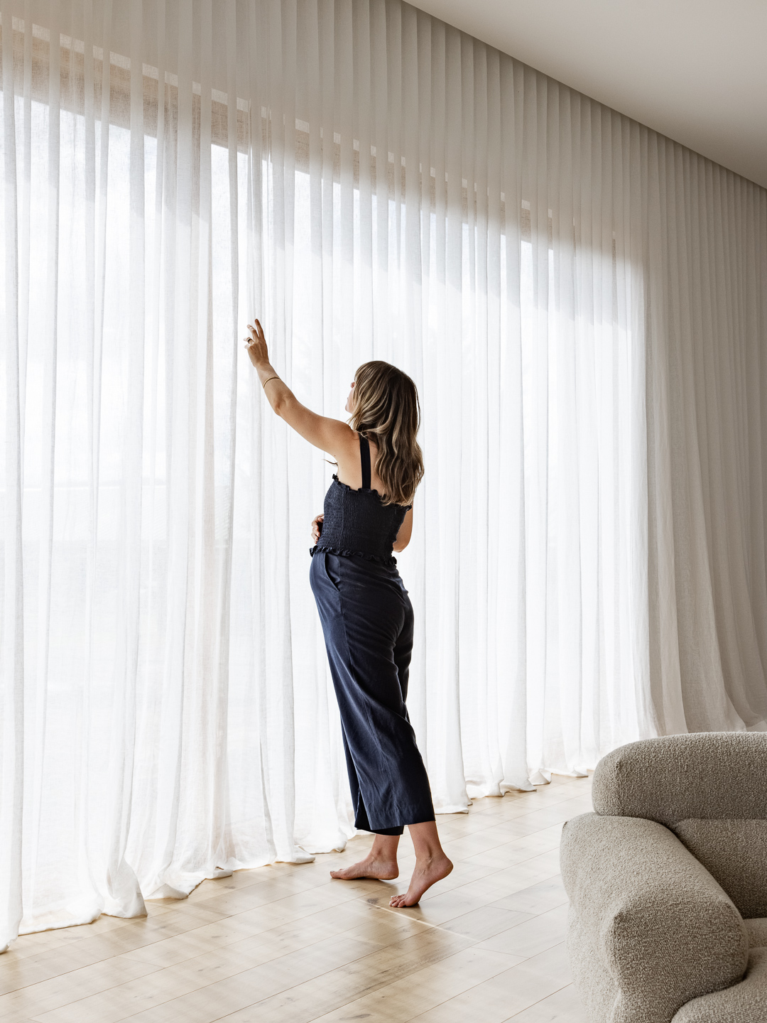
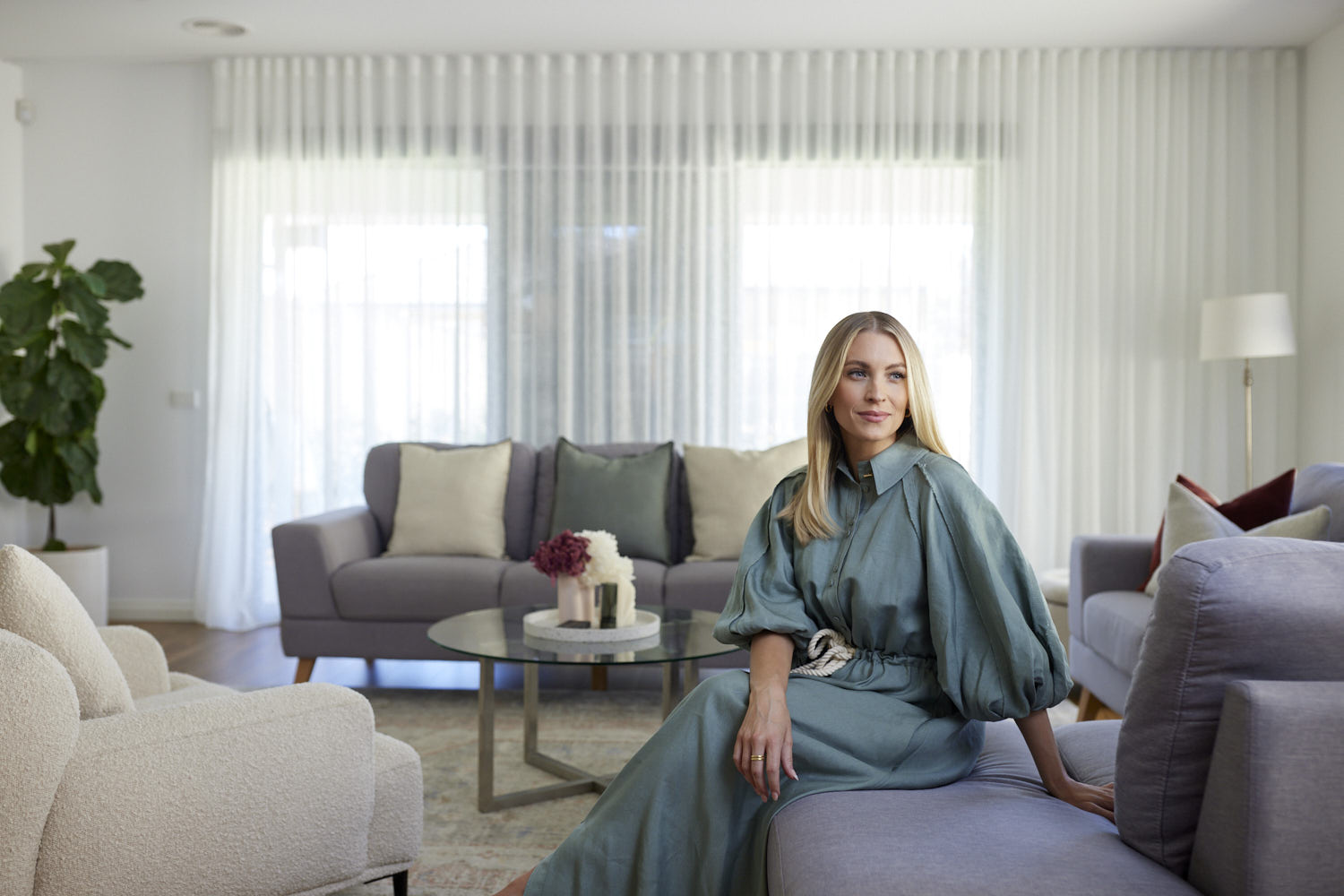
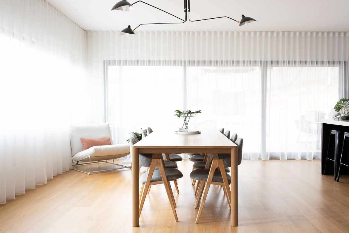
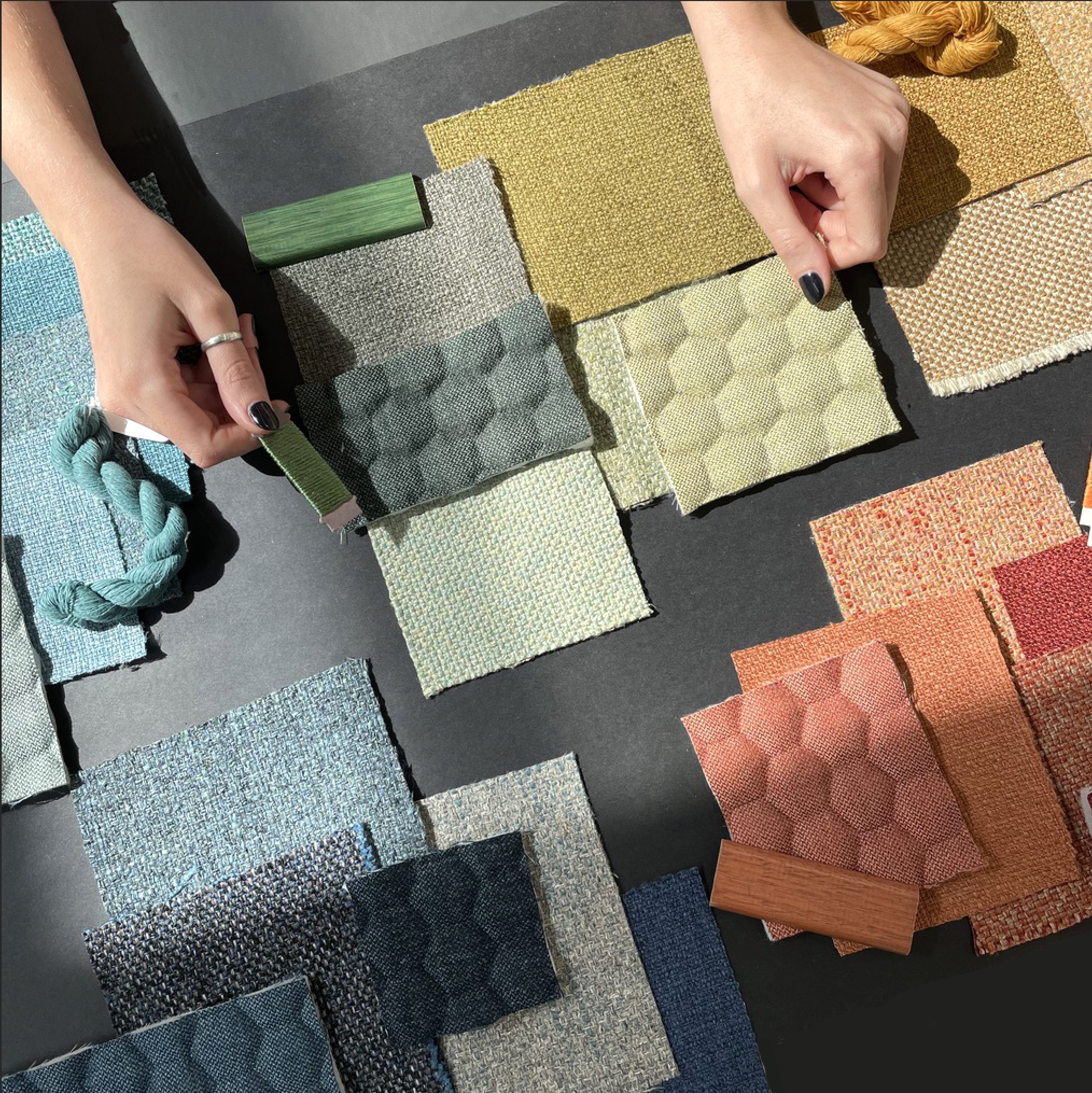
Sheer Fabrics 101 – Weave Density with Warwick Fabrics.
Sheer Curtain fabrics are a staple in interior design. In this blog, we talk through different types of Sheer fabrics and weave densities, with our design partner Warwick Fabrics.
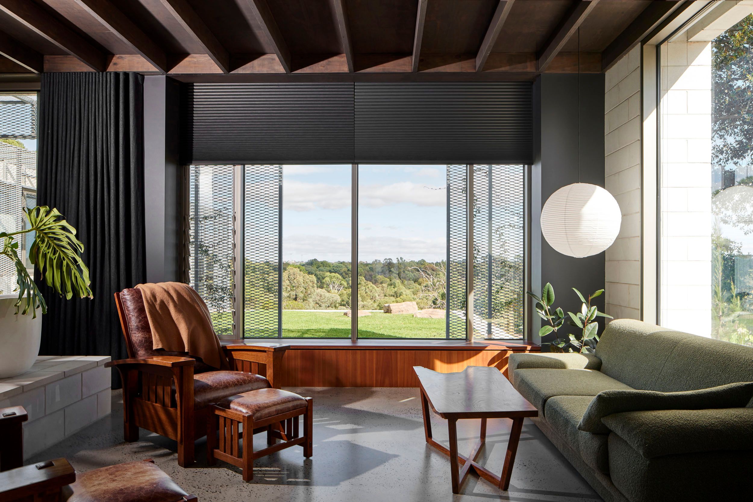
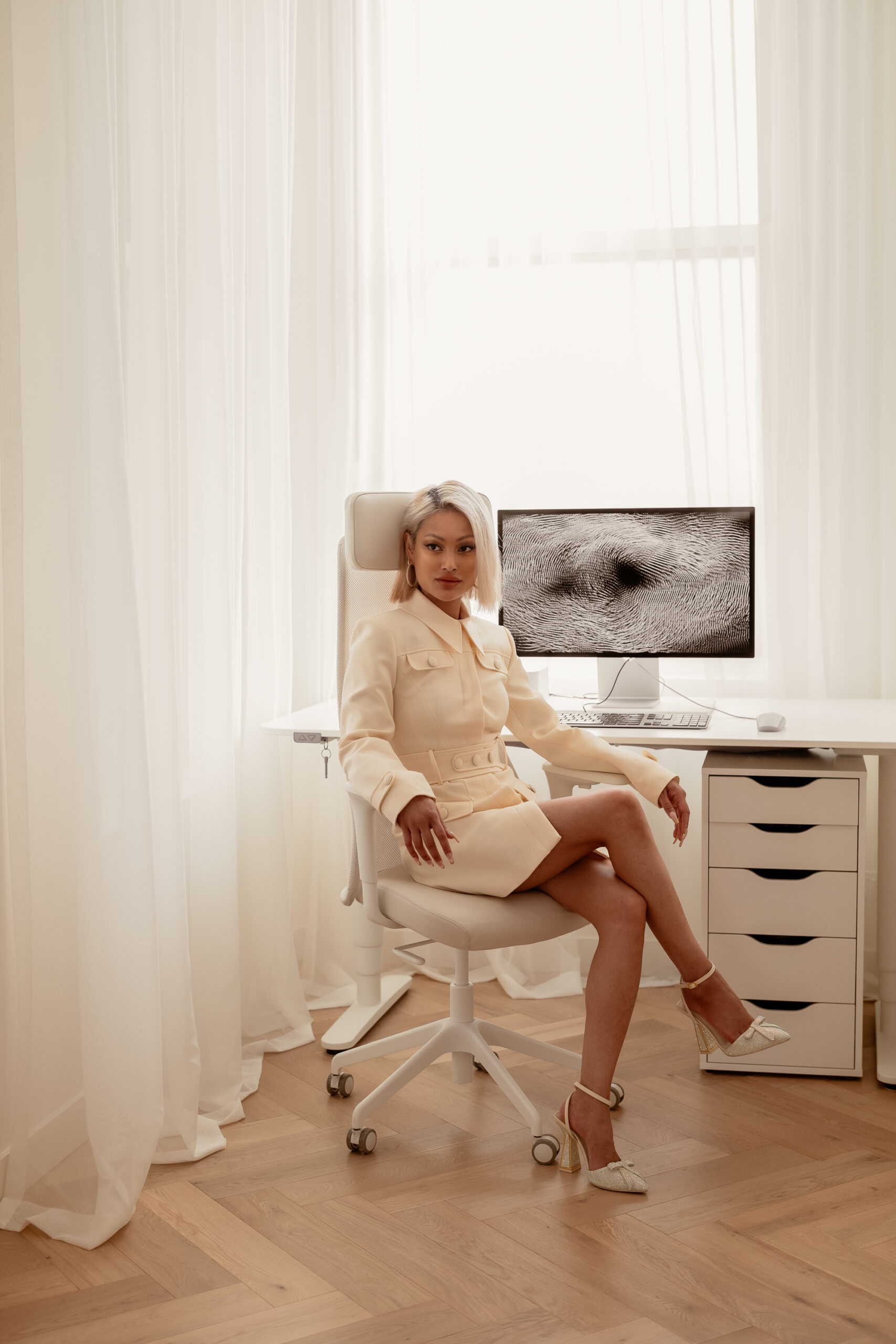
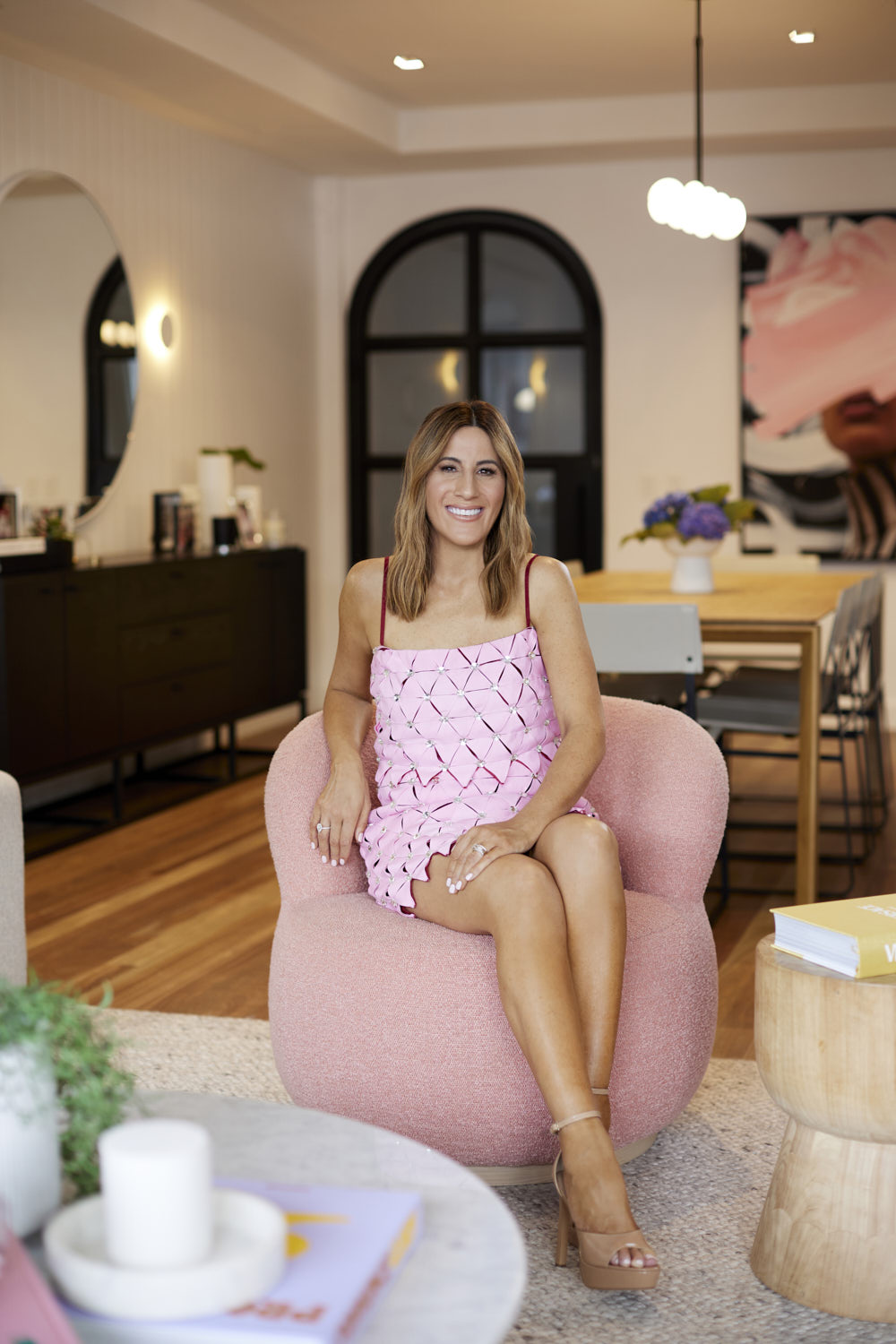
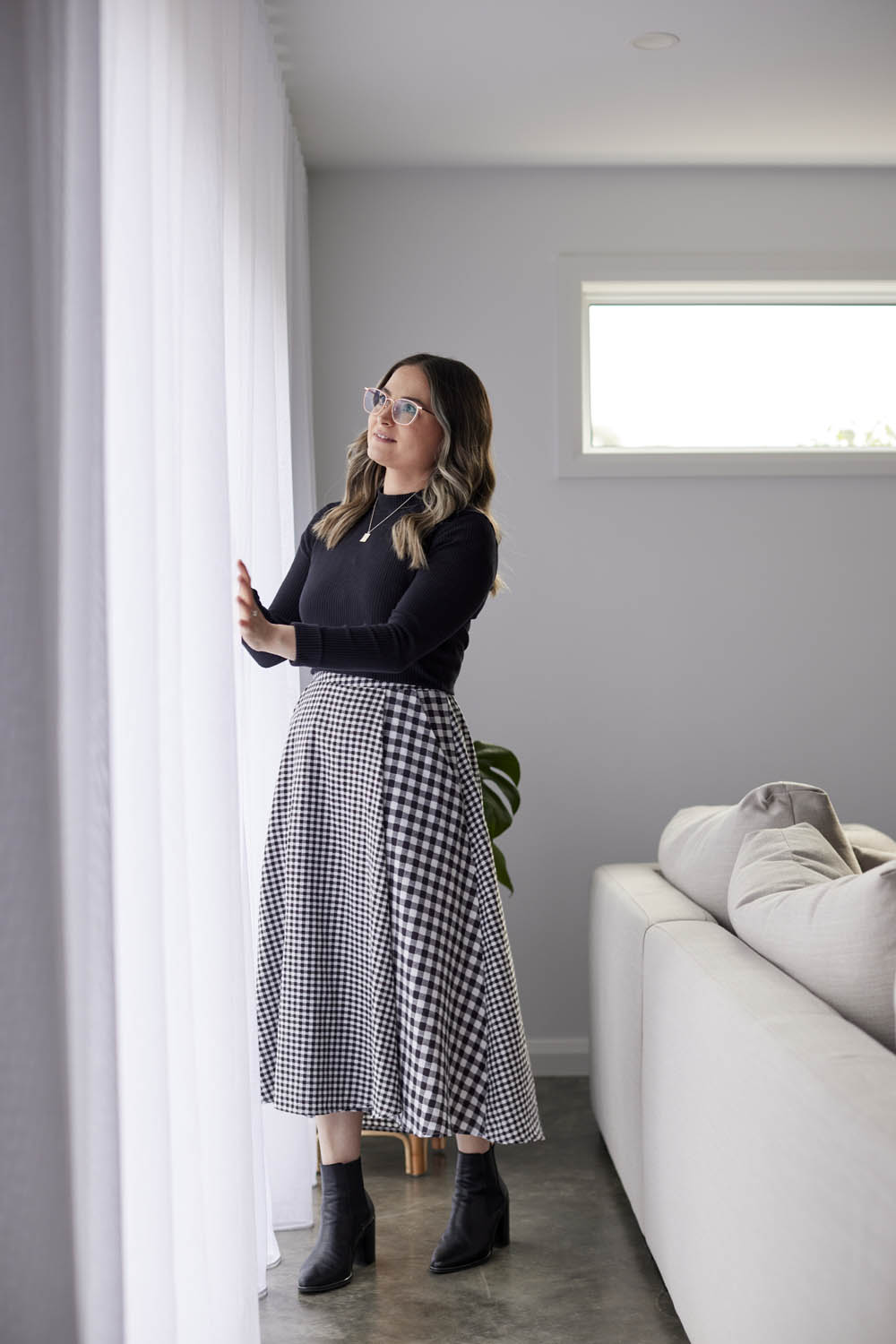
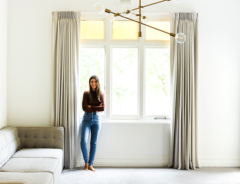
Behind the Design with Zhana Garkinis from Fourteen Oh Five.
We caught up with Zhana Garkinis, Interior Designer and Owner of Melbourne studio Fourteen Oh Five, to discuss her Aberfeldie House project, featuring our custom made window coverings.
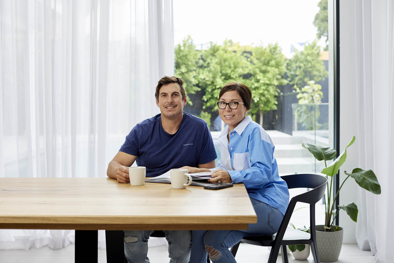
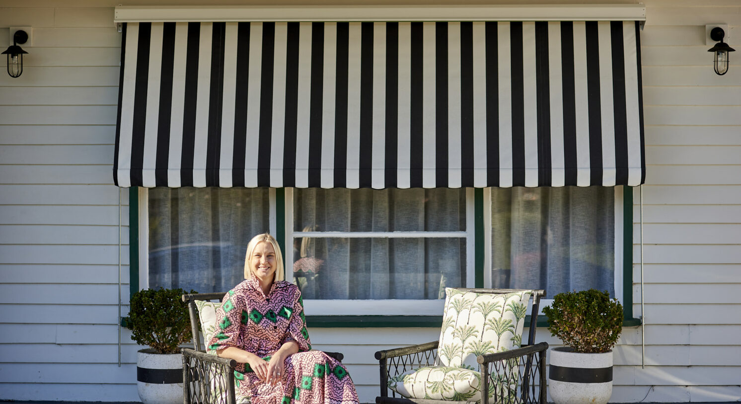
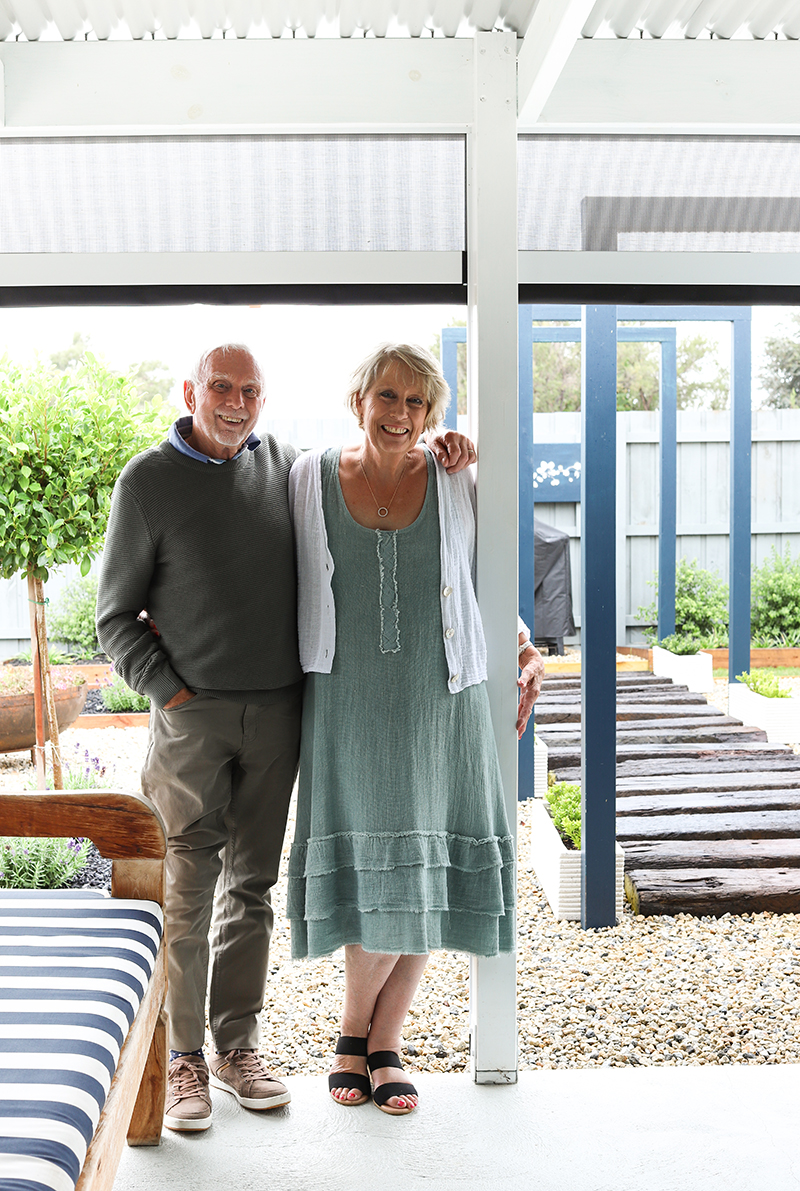
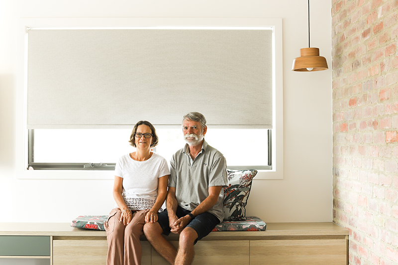
Linda + Daniel.
“The Double Curtains have added a warm, luxurious touch to our new home. We absolutely love how they enhance the curb appeal as well!”
Why choose Australian Made Window Coverings?
Discover the value of Australian Made Window Coverings — superior quality, expert craftsmanship, and support for local businesses and jobs. We take pride in delivering value in every dollar for 55+ years.
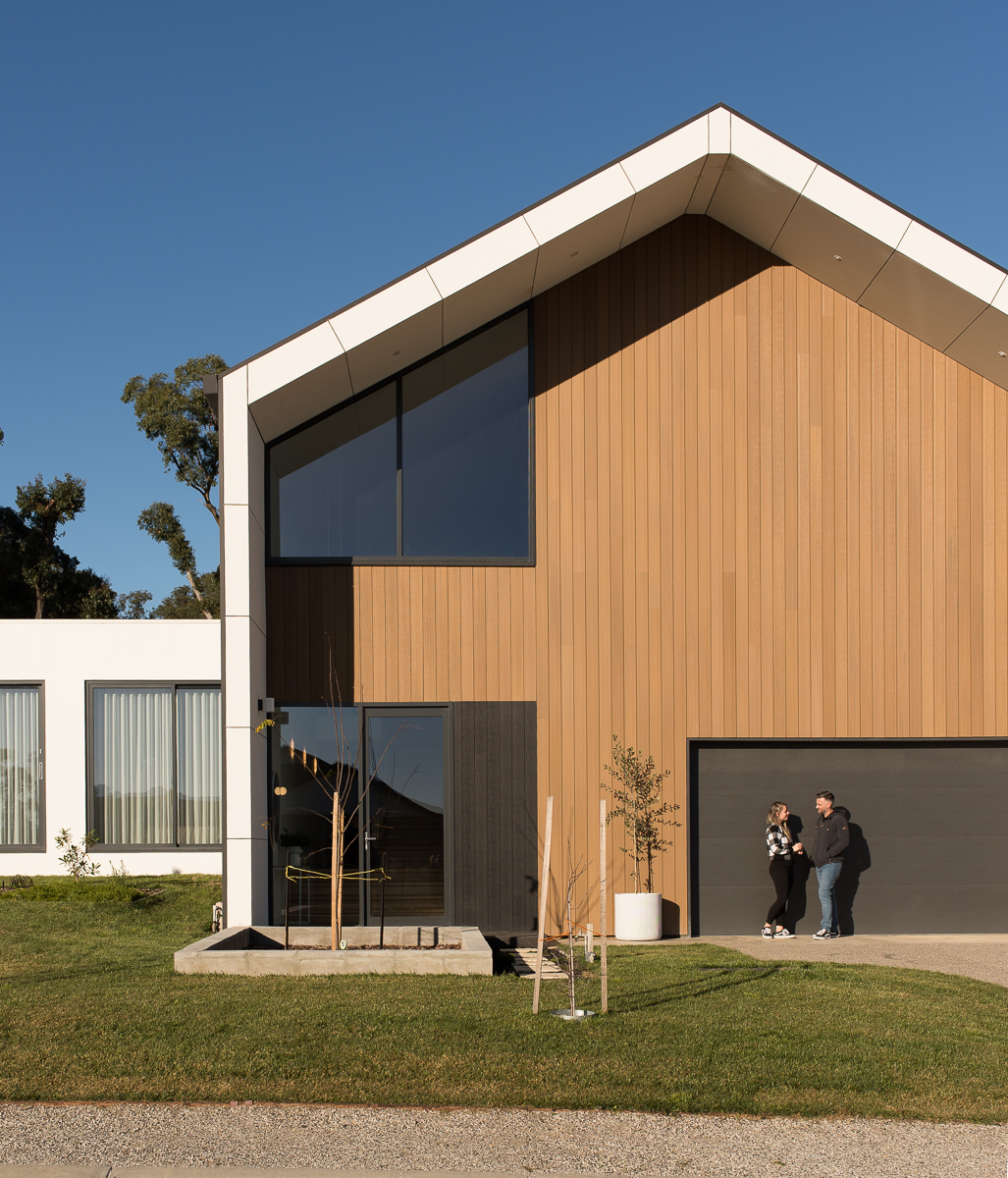
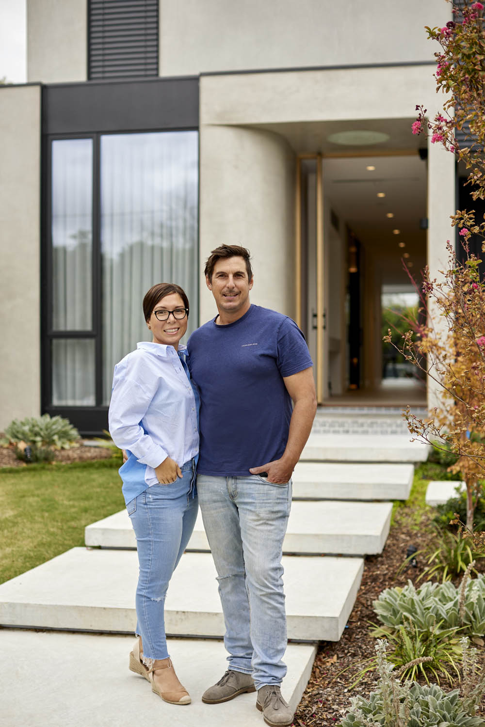
Behind the Build + Design with Free One Building Design.
Jake Freebody, Director of Free One Building Design, designed his own home that reflects his family’s style, enhanced by our locally made Double Curtains and Roller Blinds.
Colour Trend Forecast 2025 – with James Dunlop Textiles.
Discover the 2025 Colour Trend forecast with our design partner, James Dunlop Textiles. This blog explores three trending colour palettes, set to inspire interiors this year.
Behind the Design with Right At Home Staging.
Jessica and Holly from Right At Home Staging shared their transformation of a 26-year-old property into a stunning holiday home, featuring our Sheer Curtains, Roller Blinds, and Vertical Blinds.
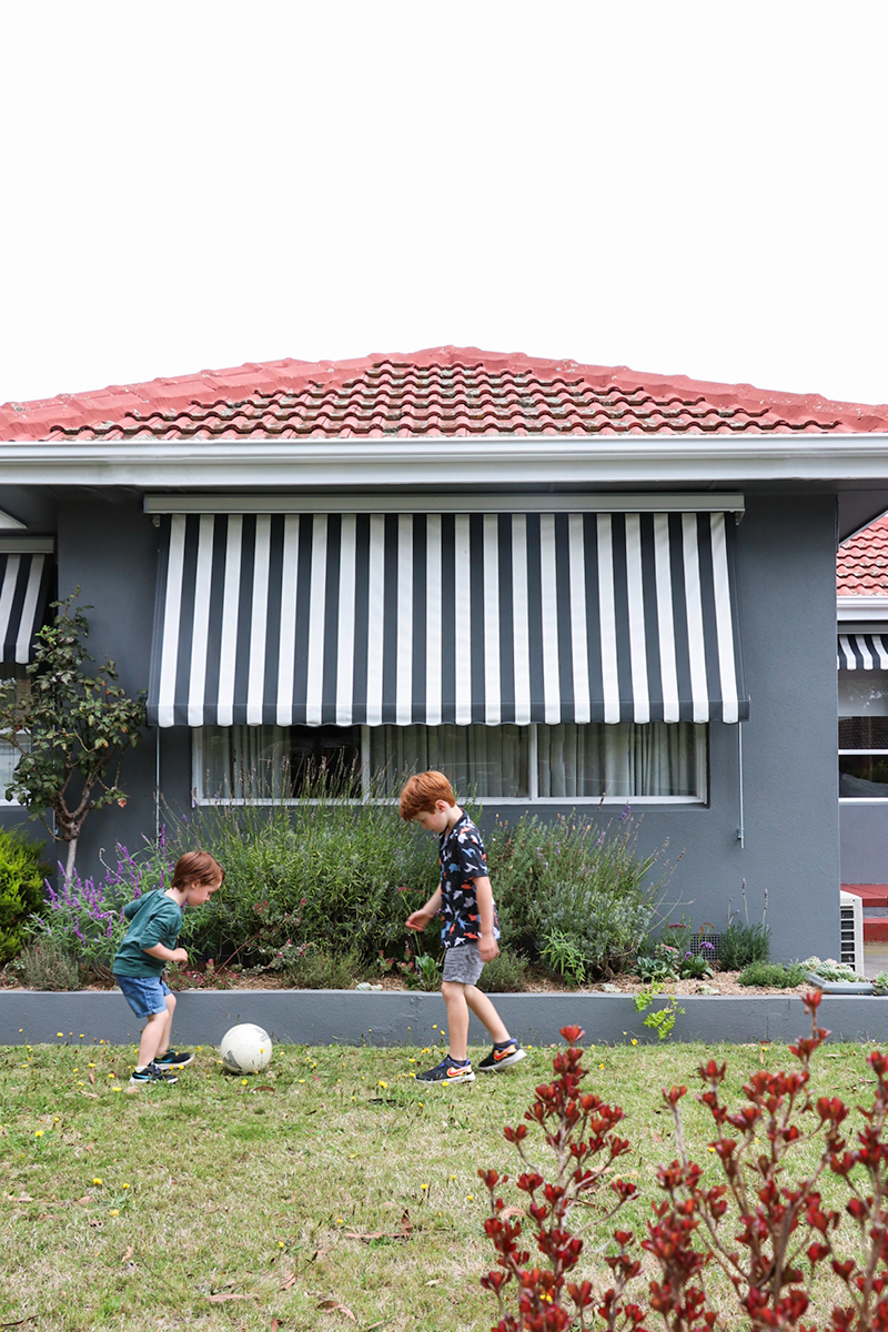
At home with Kimmy Hogan.
We catch up with Kimmy Hogan — artist and mother of three boys, as she shares her family home featuring our Sheer Curtains and motorised Roller Blinds.
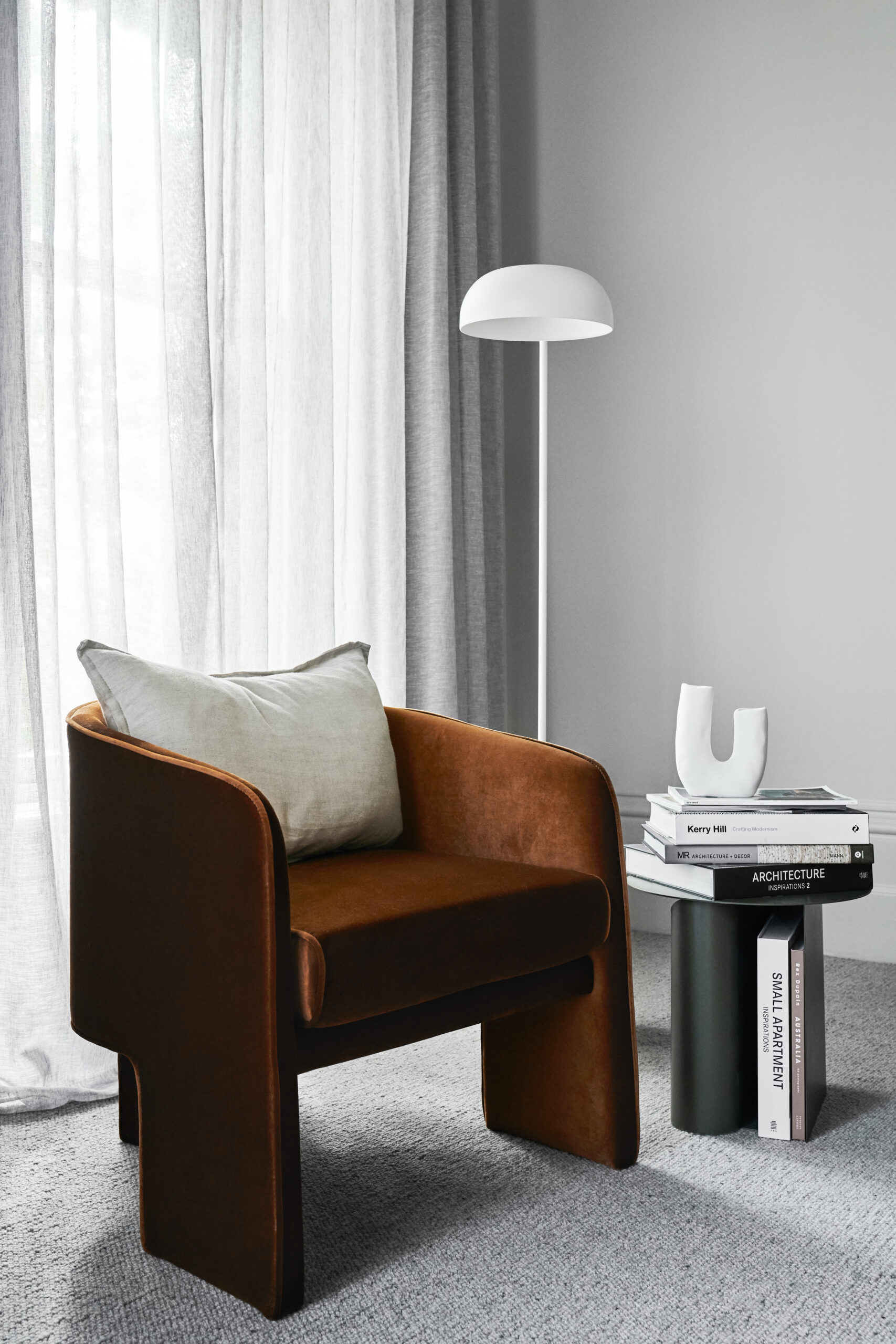
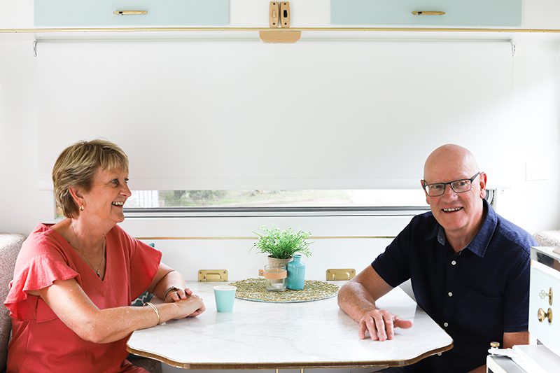
Kasey + Bradley.
“Visiting our local dc+b showroom was so helpful! I got to see the Curtain Tracks and Rods in person, and properly understand how they operate.”
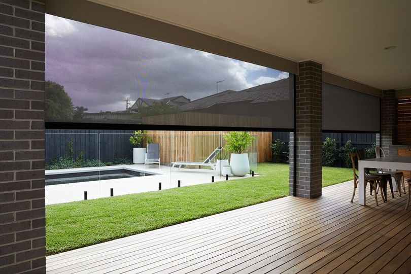
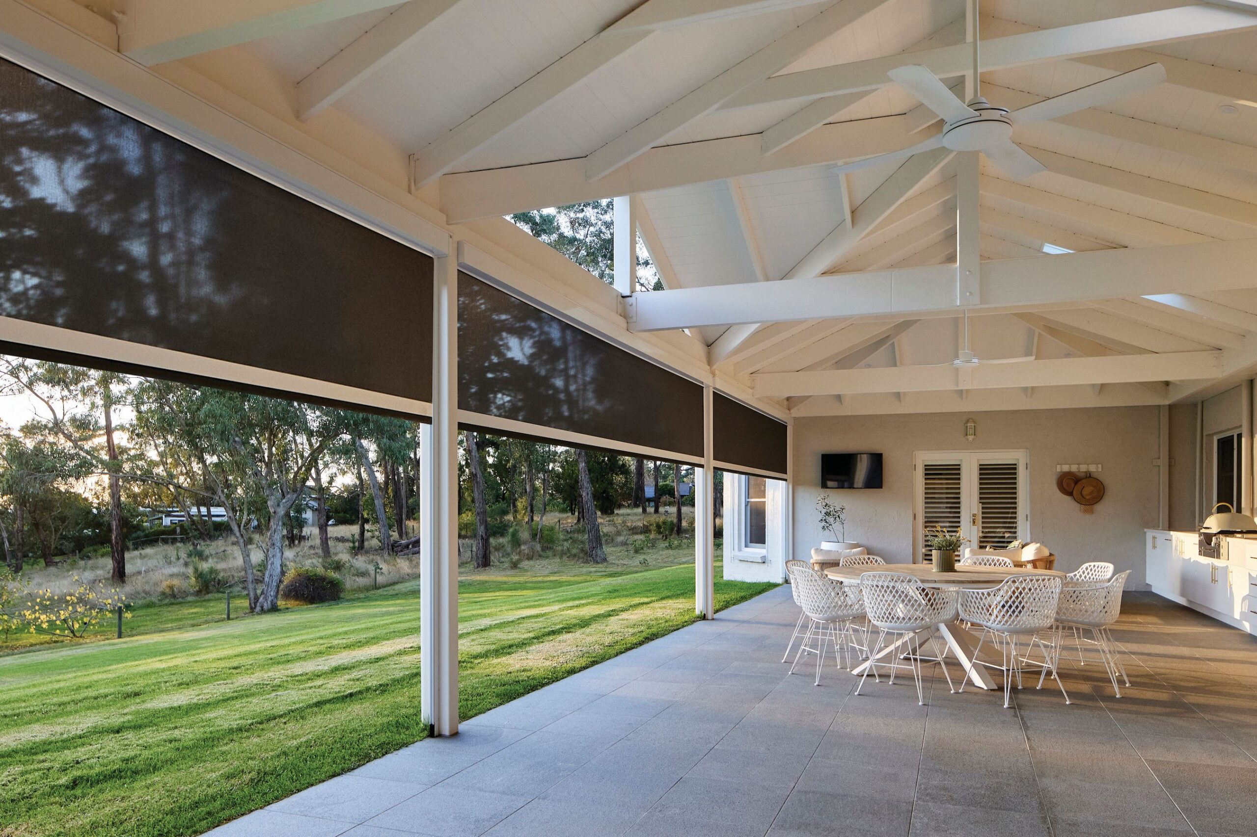
All things Outdoor Blinds + Shutters.
Discover how to enhance your outdoor space with our custom-made Outdoor Blinds and Shutters. Designed to withstand the Australian climate while adding style and value to your home.
New Automate® Push PRO remote.
We’re proud to introduce our new Automate® Push PRO remote. The most advanced Push remote yet, combining smart features with a sleek, user friendly design.
Guide to Buying High Quality + Affordable Window Coverings.
Discover how to enhance your home’s style and energy efficiency with our guide on investing in high quality, affordable window coverings.
Interior Design Tres Trends 2025 – with Warwick Fabrics.
We unveil the 2025 Tres Trends forecast with our design partner, Warwick Fabrics. Showcasing three key styles set to shape the future of interior design, this blog highlights innovative fabrics and colour palettes, along with our product recommendations.
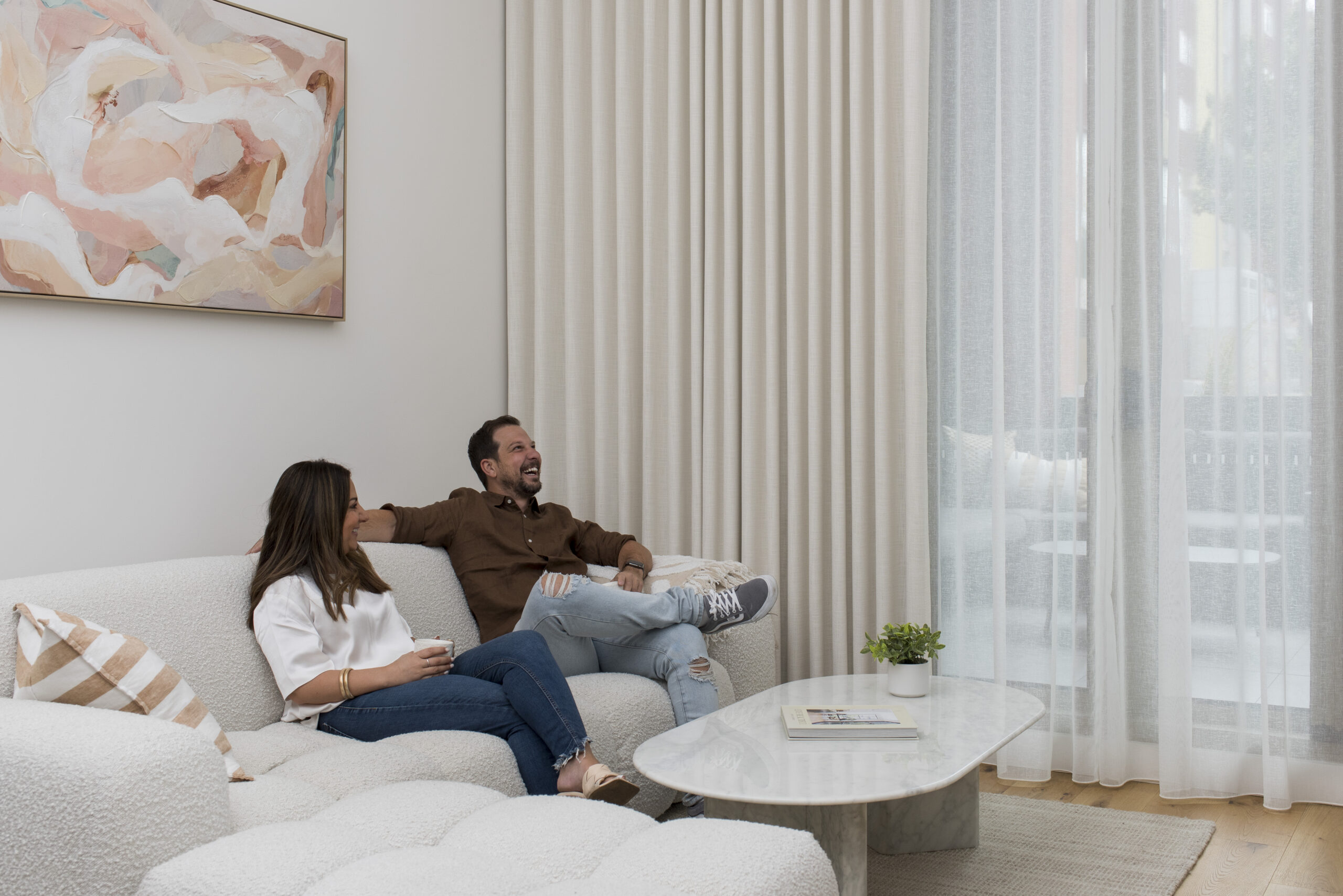
Behind the Build with Talia + Matt.
Join Talia and Matt on their journey as they renovate their third home, seamlessly blending Matt’s building expertise with Talia’s passion for interior design to create a cosy Scandi-Coastal retreat. Featuring our Sheer Curtains and Roller Blinds.

Our newest design partner – Haymes Paint.
Introducing our newest design partner, Haymes Paint. Just like us, they’re a family-owned company with decades of expertise, dedicated to quality and proudly Australian Made.
Hamptons Haven.
After holidaying in the USA and visiting The Hamptons, Elle and Troy fell in love with the iconic style the area is famous for. To bring a similar look into their South Gippsland home, they chose our Roman Blinds, Sheer Curtains, Shutters, and Roller Blinds.
New product – Roller Blind Magnetic Wand Control.
Discover the latest in Roller Blind technology with our Magnetic Wand Control. Safe, intuitive, and cost-effective, this innovative solution offers seamless automation for your home or business.
Best Thermal Curtains + Blinds for insulation.
Learn how our locally made, thermal window coverings can reduce heating/cooling loss and energy bills, enhancing comfort year-round.
Beachside Bliss.
When Debbie and her husband first bought a tiny two bedroom home in a seaside village on NSW’s South Coast, they never intended to live in it. They adore the way our Blinds, Shutters and Awnings have helped transform their home.
Talia + Matt.
With Matt as a builder and my sister as a designer, our renovation of an outdated weatherboard home went smoothly. Transforming it into my favourite Scandi-Coastal style, we added Sheer Curtains and Roller Blinds for a soft, calming ambience.
Coastal Breeze.
When Sharon and her husband decided to build a new home in the seaside town of Batemans Bay on NSW’s south coast, it was all about the view. Since, they have enhanced their home with our Curtains, Blinds and Awnings.
The Cleyne’s.
Building our Hamptons-style home, we wanted to add our own personal touch. The selection was a breeze with stunning fabric and styling recommendations. The Curtains, Blinds, and Shutters perfectly compliment our home.
Interior Design + Curtain Trends 2024 – with Basford Brands.
Explore the forefront of the latest interior design trends with our valued design partner, Basford Brands, as we uncover the inspiration shaping the landscape of living spaces.
How to Choose the Perfect Curtain Heading Style for Your Home.
We dive deep into Curtain Heading Styles with James Dunlop – crafting your perfect look with style + precision.
Behind the Build with Beccy Cloke.
We chat with Beccy Cloke about her captivating home renovation journey in the Yarra Valley, as she transforms her family’s hobby farm dream into a reality.
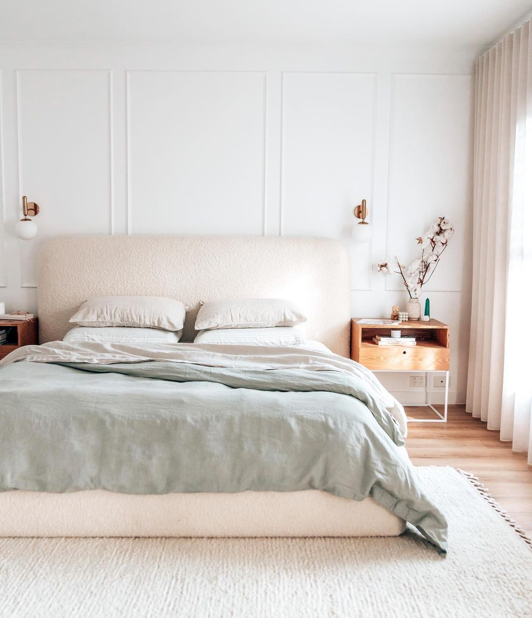
The Ultimate Guide to choosing the best Blinds for Bedrooms.
Your own personal haven — the bedroom. Just as you carefully select the right bedding and furniture, choosing high quality bedroom window coverings is equally paramount.
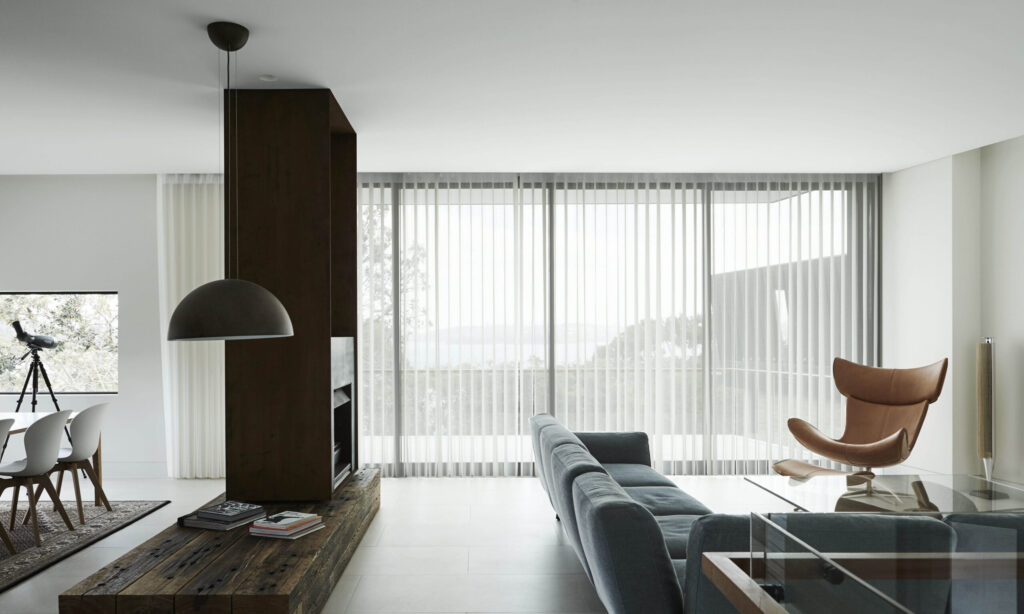
How to choose living room Curtains + Blinds.
The heart of your home — the living room. Where gatherings with family and friends, movie nights, and cosy moments on the couch unfold.
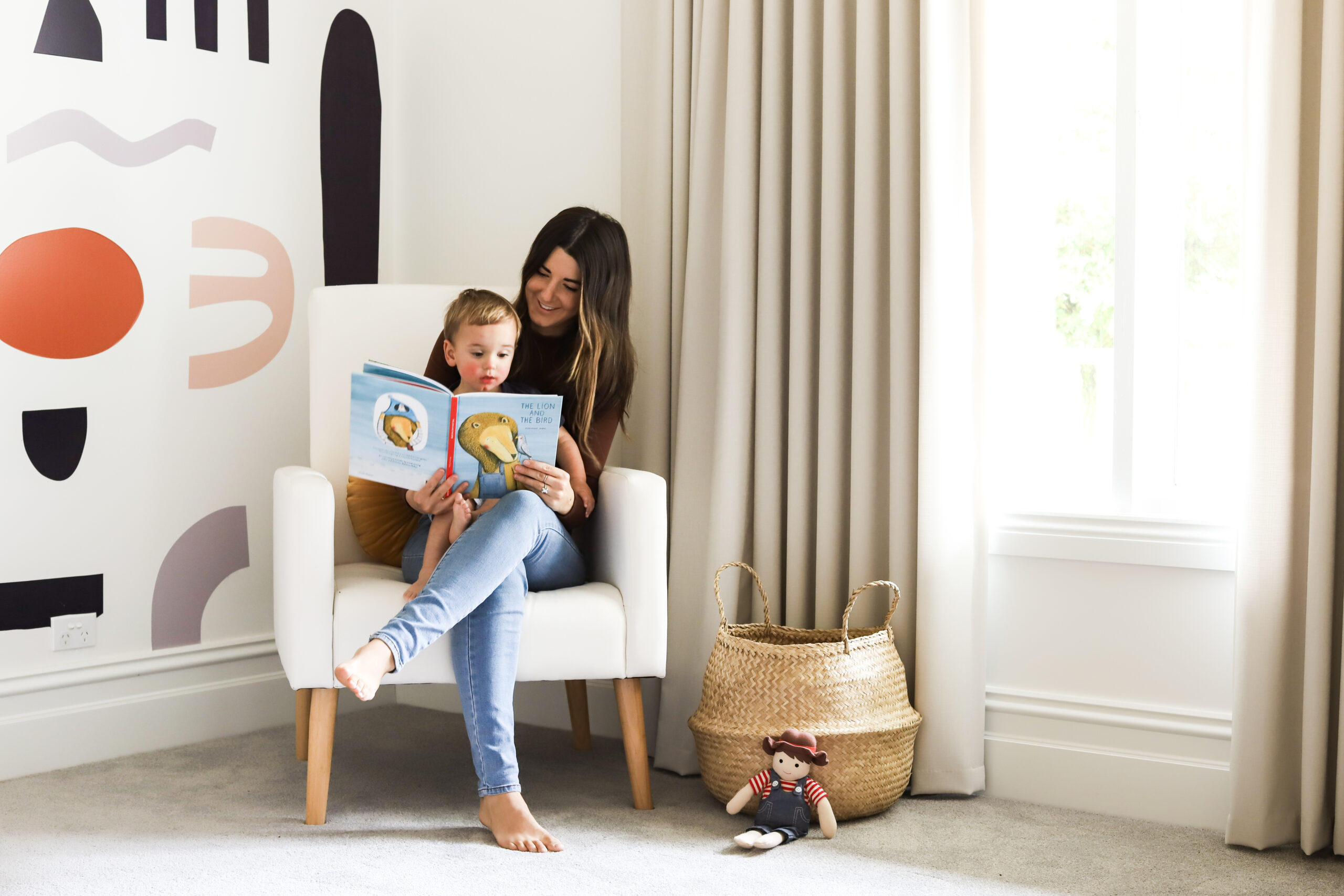
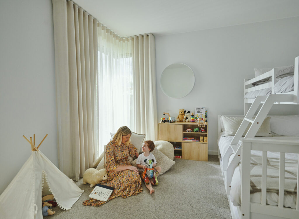
Window coverings for nurseries + children’s rooms.
The best window covering solutions for nurseries and children’s rooms, and why.
Behind the Build with Amelia Lamont “The Midwife Mumma”.
We chat with Amelia Lamont, also known as ‘The Midwife Mumma’, discussing the journey of creating her ideal sanctuary for family life. Featuring our Automated Roller Blinds.
Best Blinds, Awnings + Shutters for outdoor entertaining.
Suitable for almost any outdoor space, outdoor Blinds can help you not just enjoy the great outdoors, but embrace it.
At home with Abby Gilmore.
Discover the story behind Abby Gilmore, the digital creator and mother of three, as we explore the journey in crafting her humble abode in Gisborne.
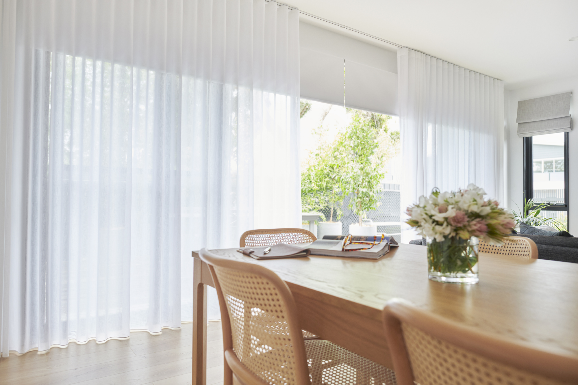
How to layer Sheer + Blockout Curtains.
A comprehensive guide on how to layer Sheer and Blockout Curtains.
What are Veri Shades®?
We show you the ins and outs of this hot product and why it’s a great choice for every home.
Best Curtains + Blinds to keep the cold out this Winter.
Learn which Curtains and Blinds are the best to keep your home warm this winter from the experts at dc+b.
Proudly partnering with Grand Designs Australia.
Exclusive Trade Partner for Grand Designs Australia House of the Year.
Curtains, Blinds, or Shutters – Which Should You Choose?
Learn about the differences between Curtains, Blinds and Shutters and which are best for you and your home.
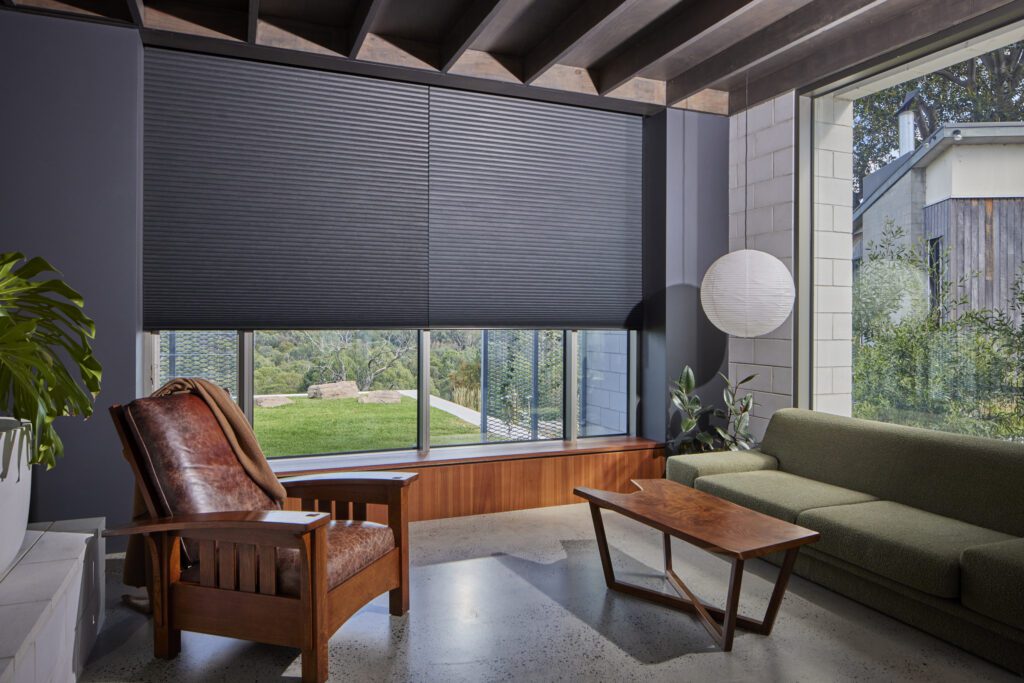
Environmental Elegance.
When planning their build, which would soon become their forever home, the owners wanted to create a sustainable yet stylish oasis. With sustainability and the environment being a priority, they opted for our Cellular Blinds.
At home with Jess Dempsey.
We chat with Jess Dempsey, creative director, stylist and host of Holistic Living TV, who recently renovated her Mornington Peninsula beach house.
At home with Micah Gianneli.
We chat with Micah Gianneli, digital creator, who recently renovated her Bayside home. With a love for minimalist and neutral styles, our Sheer Curtains complimented her dreamy space.
DIY vs Professional Installation of Blinds + Curtains | Pros + Cons.
DIY or professional installation? We cover the Pros and Cons of both to help you make the best decision for your home.
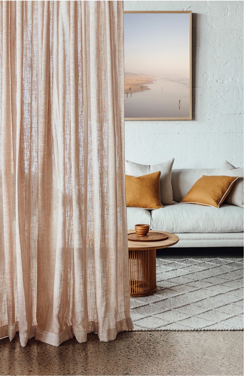
Trends in Sheers.
We take a closer look with James Dunlop into the current trends in Sheers Curtain fabrics.
At home with Gina Ciancio.
We chat with Gina Ciancio, Interior Designer at ‘Style Curator’, who recently renovated her family home featuring our Curtains and Blinds.
Delicate, light, translucent Sheers.
We dive into the finer details of Sheer Curtains with James Dunlop.
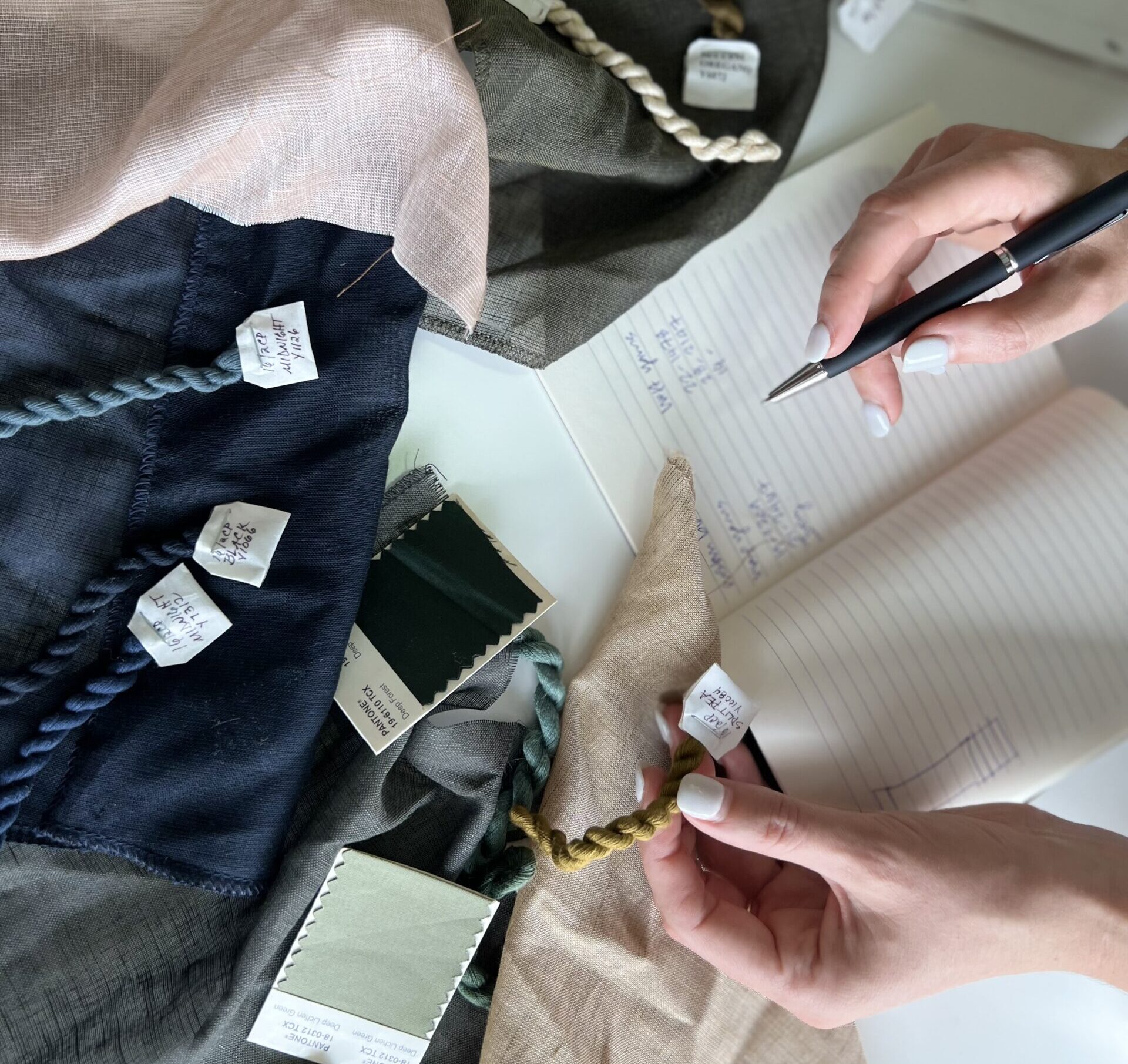
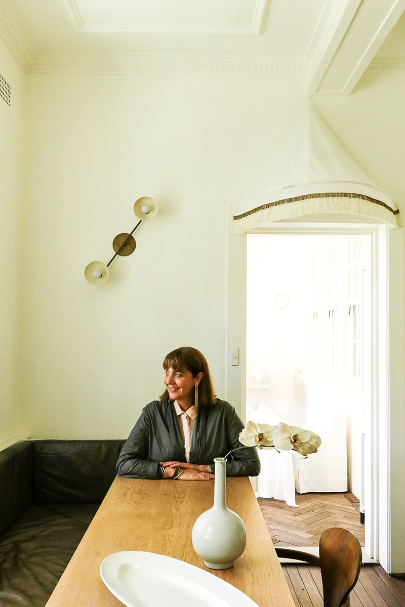
Inside the studio with James Dunlop.
This week we step inside the studio of James Dunlop to meet Annie Moir and to talk about their beautiful range of fabrics.
At home with Emily Jury.
At home with Emily Jury, Interior Stylist + Designer. Emily shares how our Curtains have helped bring a sense of calm and soften her home.
Behind the Build with Andrijana Henry.
Explore the journey of Andrijana + Blake, who built their dream home in Woodend, a semi-rural town offering the ideal backdrop for family life.
How to save money (+ the environment).
If you want to save money and the environment (and who wouldn’t?), consider these window covering options.
At home with Lana Wilkinson.
We’re At Home with Lana Wilkinson, fashion + celebrity stylist. We sit down with Lana to find out more about her design inspiration and what she is working on at the moment.
Behind the Build with Natalie + Mark Pappalardo.
We chat with The Pappalardo’s, parents of three and owners of a building company. They share their story of finally constructing their own dream family home, following years of crafting homes for others.
Behind the Build with Emily Jury + Bec Douros from Nectaar.
We chat with Emily Jury + Bec Douros, Interior Designers at Nectaar. Emily tells us about her new home and what she recommends when going through a new build process.
At home with Amelia Webb.
We’re At Home with Amelia Webb, makeup artist extraordinaire. We sit down with Amelia to find out where she gets her interior inspiration from, as well as her love for fashion and motherhood.
At home with Natasha Webb.
We’re At Home with Natasha Webb, celebrant, mother, and ‘colour lover’. We sit down with Tash to find out more about where she gets her inspiration from and her love for the 80’s.
Behind the Design with Gina Ciancio.
We chat with Gina Ciancio, Interior Designer at ‘Style Curator’, who recently renovated a client’s house. Featuring a mix of Curtains, Blinds and Shutters throughout the home.
Design symphony.
When David Cook-Doulton and Martin Shew first heard that a handsome building that once housed Bendigo’s oldest bank was for sale, they knew it had potential to become their latest luxury accommodation offering.
Waltzing matilda.
After Rachael and her partner finished building a townhouse near the beach in Rosebud, on Victoria’s Mornington Peninsula, she couldn’t wait to bring her dreams of a relaxed coastal interior to life. Featuring our Curtains and Blinds.
Refined luxe.
When Lauren and her partner renovated their home in Melbourne’s north eastern suburbs they considered the window furnishings such an important part of the project they factored them in at the beginning.
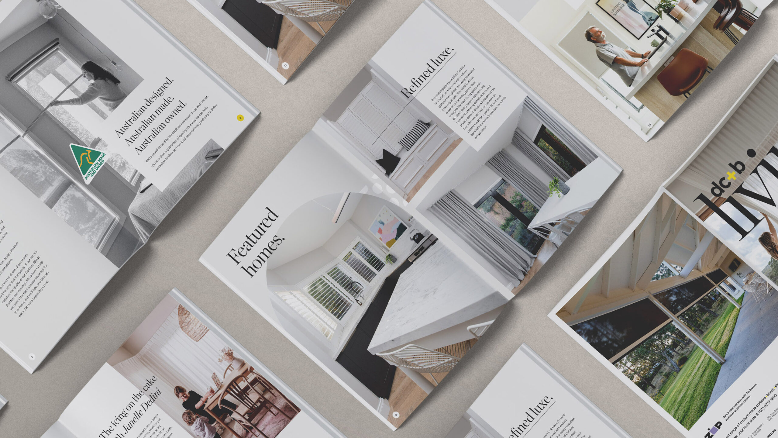
Read the latest dc+b living magazine.
Don’t know where to start? We’re specialists in indoor + outdoor window coverings so let us inspire you.
Learn about Shutters + Exterior Window Coverings.
Chasing the sun. Learn everything you need to know about stylish, versatile and affordable Shutters and Awnings.
Contemporary opulence.
When David Cook-Doulton and Martin Shew first spotted the two-storey Victorian property that would eventually become known as Lyon House, they knew it would be perfect for their latest boutique accommodation offering in Ballarat.
Heritage glamour.
When Kristie and her husband Callum first viewed their 1895 Victorian villa in Ballarat’s sought-after inner-city suburb of Soldiers Hill, it was love at first sight, despite the house needing some attention.
Scandi style.
Like a lot of first-time home builders, Cheryl and her husband Randell found the process of building their new home both an exciting and stressful experience. The couple couldn’t be happier with the change Curtains and Shutters have brought to their home.
At home with Suzi Appel.
We sit down with Suzi Appel, freelance commercial photographer of interiors, lifestyle, and art. Featuring our locally crafted Curtains and how they have helped enhance her home.
Designer window treatments. Get The Block look.
Get The Block look with these 7 dos and don’ts of window coverings.
Behind the Build with Caitlyn May.
We chat with Caitlyn May, primary school teacher, who was recently brave enough to build a new house. Featuring our custom made Curtains and Shutters.
At home with Megan Morton.
We chat to Megan Morton, renowned stylist, best selling author and founder of ‘The School’. Working her ‘house whispering’ magic, her clients span from celebrities to the pages of Vanity Fair.
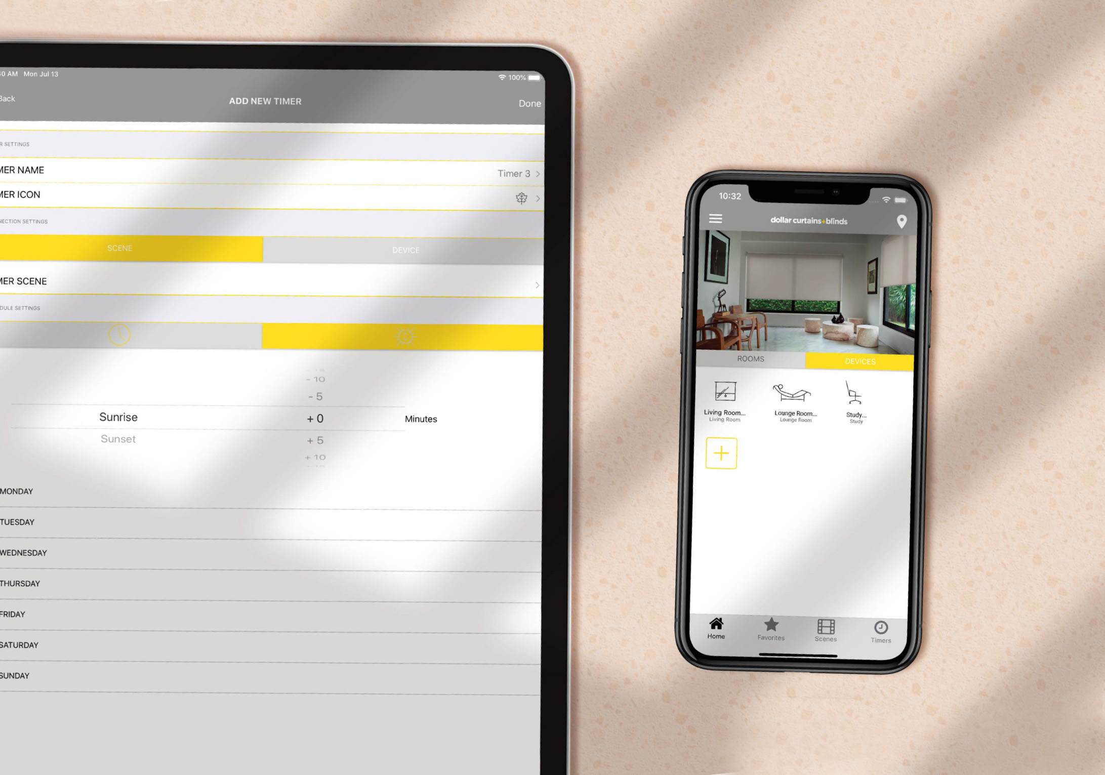
Automating your Window Coverings has never been easier.
Auto pilot. Love pushing buttons or the sound of your own voice? Automate your window coverings and never get off the sofa again.
At home with Anna Egberts.
We sit down with Anna Egberts, mother, artist, and graphic designer. Drawn to bright pops of colour and florals, Anna loves to create and paint.
At home with Sarah Pickersgill-Brown.
We chat to Sarah Pickersgill-Brown, stylist and mother to gorgeous twin boys. We find out more about her and get an understanding on how she designs and styles.
At home with Janelle Dedini.
We’re At Home with Janelle Dedini, all round creative and founder of Cake Ink in her Melbourne based studio. Janelle’s handcrafted designs have been featured in numerous magazines.
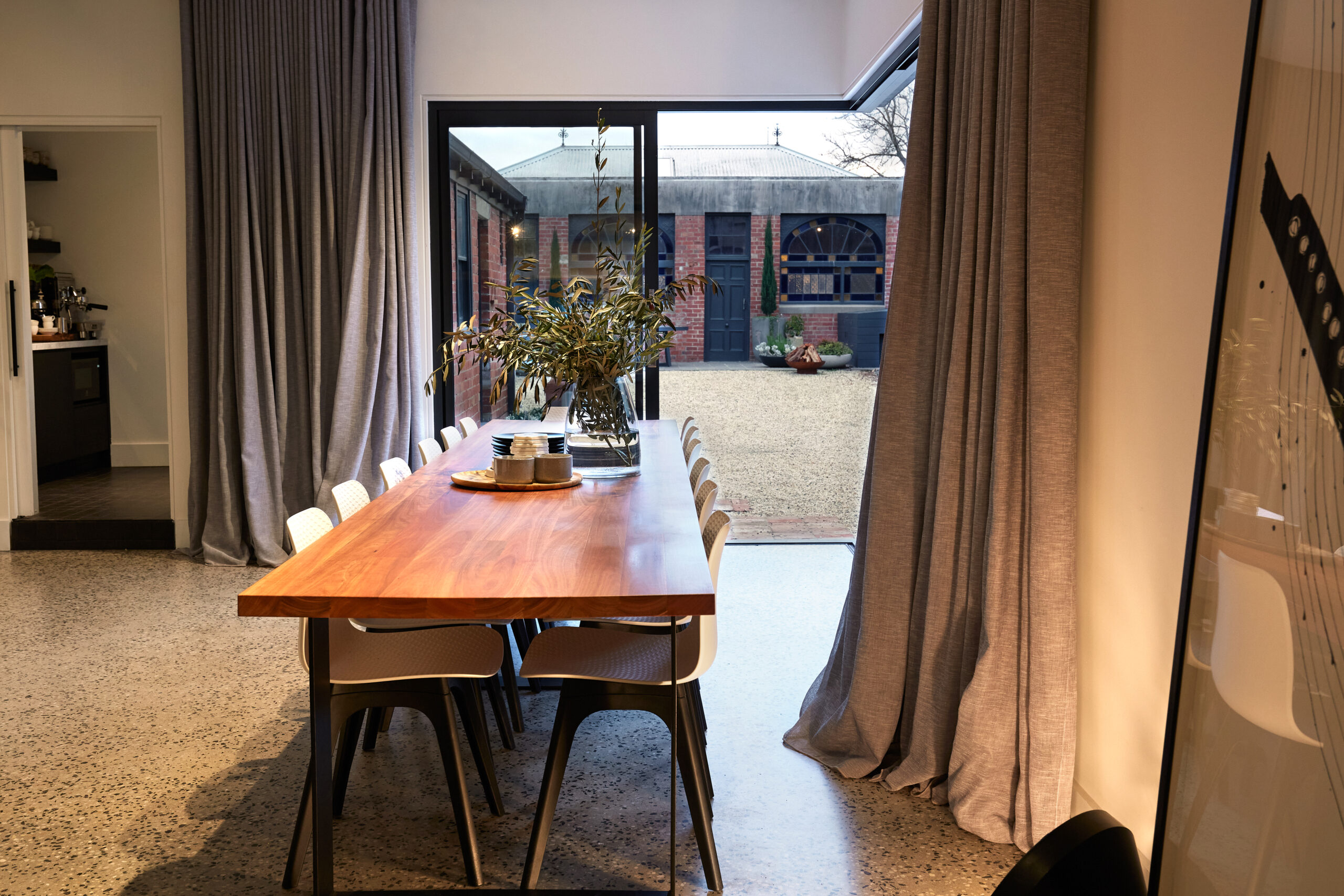
The Watson’s.
I love our glass doors, they’re wonderful for light, but the S-track Sheers really work to soften the whole room.
Stella.
I wanted to elongate the room and add softness. Our Curtains in Driftwood work so well in our sitting room. Just stoke the fire!
The Edlin’s.
The graphic quality and general busyness of our dining room are paired with the quiet simplicity of our white Roller Blind in a muted fabric. It gives the room a sense of privacy and clean lines.
Let’s talk Blinds.
Let’s talk Blinds – the different options and why you might choose one over the other.
Rural glamour.
Having previously renovated an 1880s terrace in inner-city Melbourne, Carmel and her husband Lance decided to look for something with a little more outdoor space as their two young sons started to grow.
Maggie + Jack.
The Awnings are so easy to use and give us the chance to use the outdoors as a real room.
Jess.
I wanted to have something wonderful. When I saw the floral fabric range, I knew I wanted a garden print. I love living amongst daisies, magnolias and flannel flowers!
The Shannon’s.
Roller Blinds don’t take up a lot of room visually. It’s uninterrupted views and perfectly frames the room.
Michael.
The addition of my favourite dollar curtains + blinds Sheer Curtain was a subtle yet easy way to re-imagine my living area, while bolstering the existing luxury feel of a high-end build.
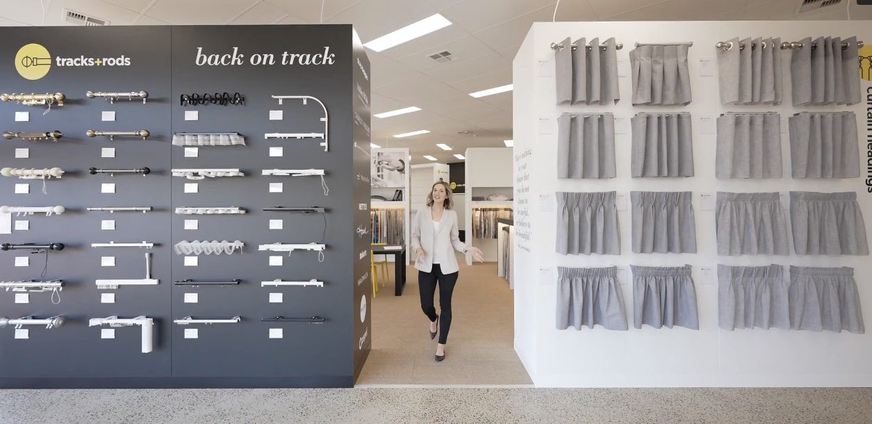
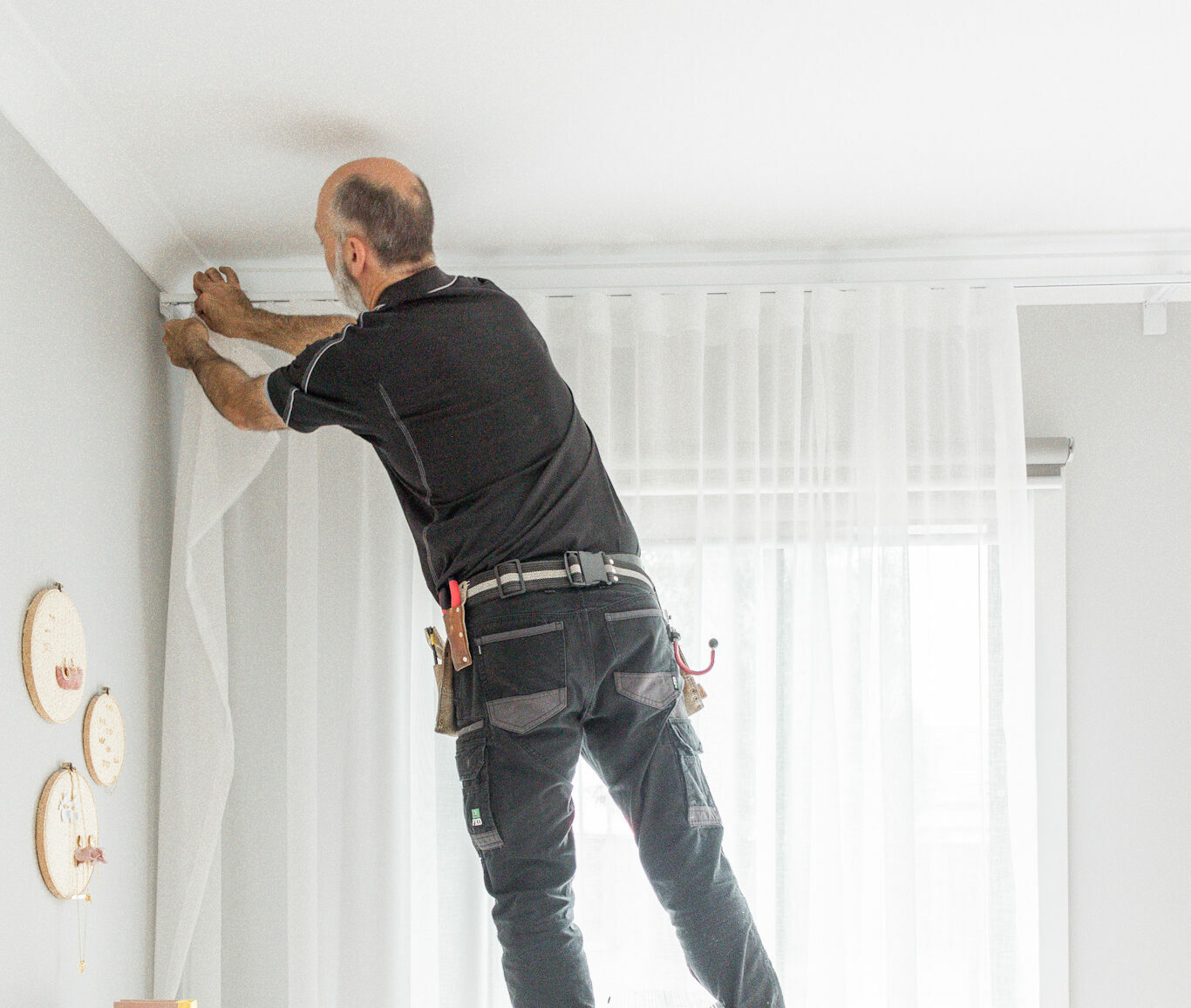
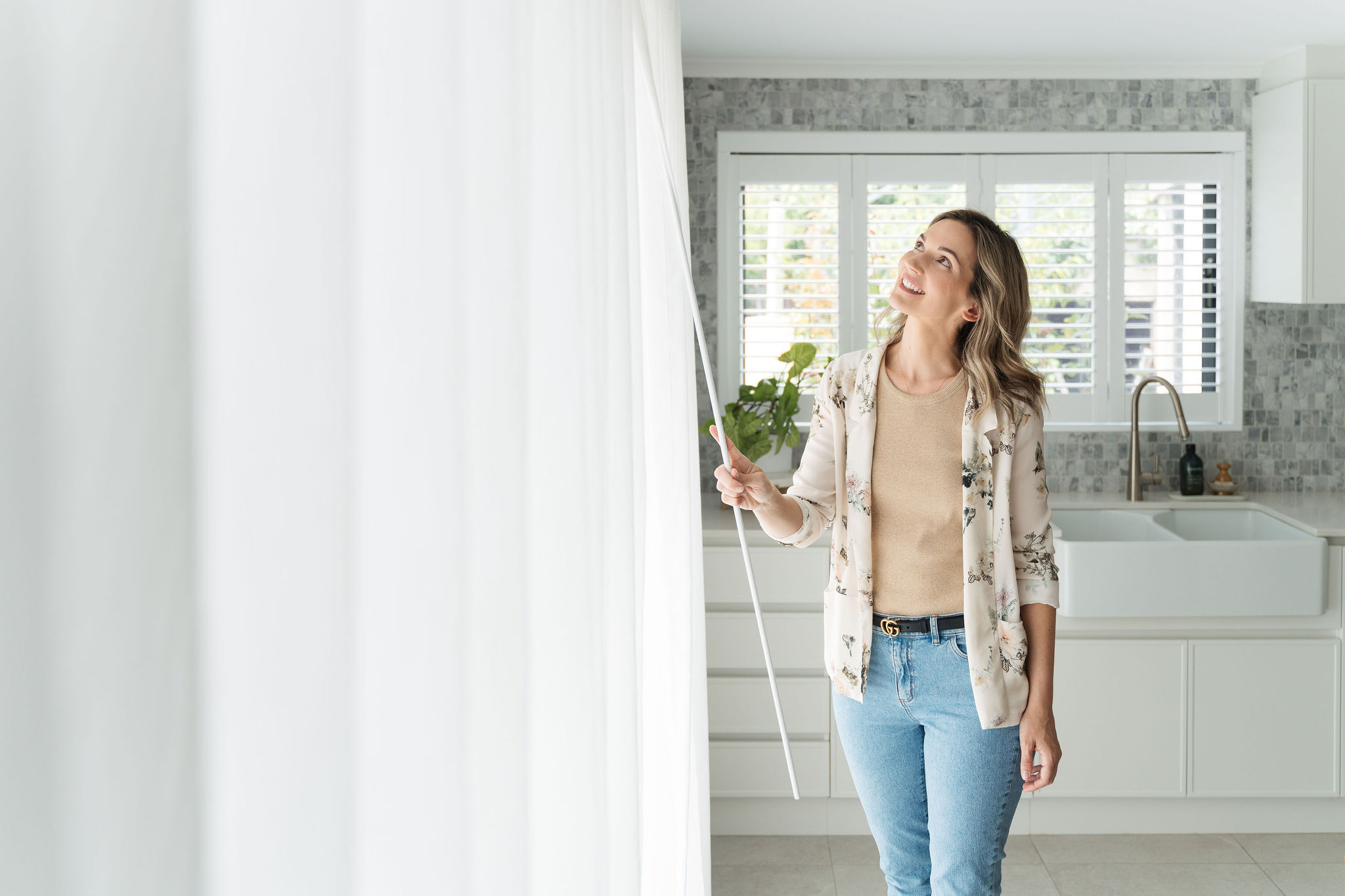
Understanding Curtain Headings + Tracks/Rods.
Heading back on track. Understanding Curtain Headings and Tracks/Rods.
Gabbie.
We wanted to soften the salon, add a sense of calm, and these Pearl Sheers on S-tracks do this so well. People come to The Native Co for some downtime and serenity. We needed our Curtains – visible to all from the outside and in – to reflect this.
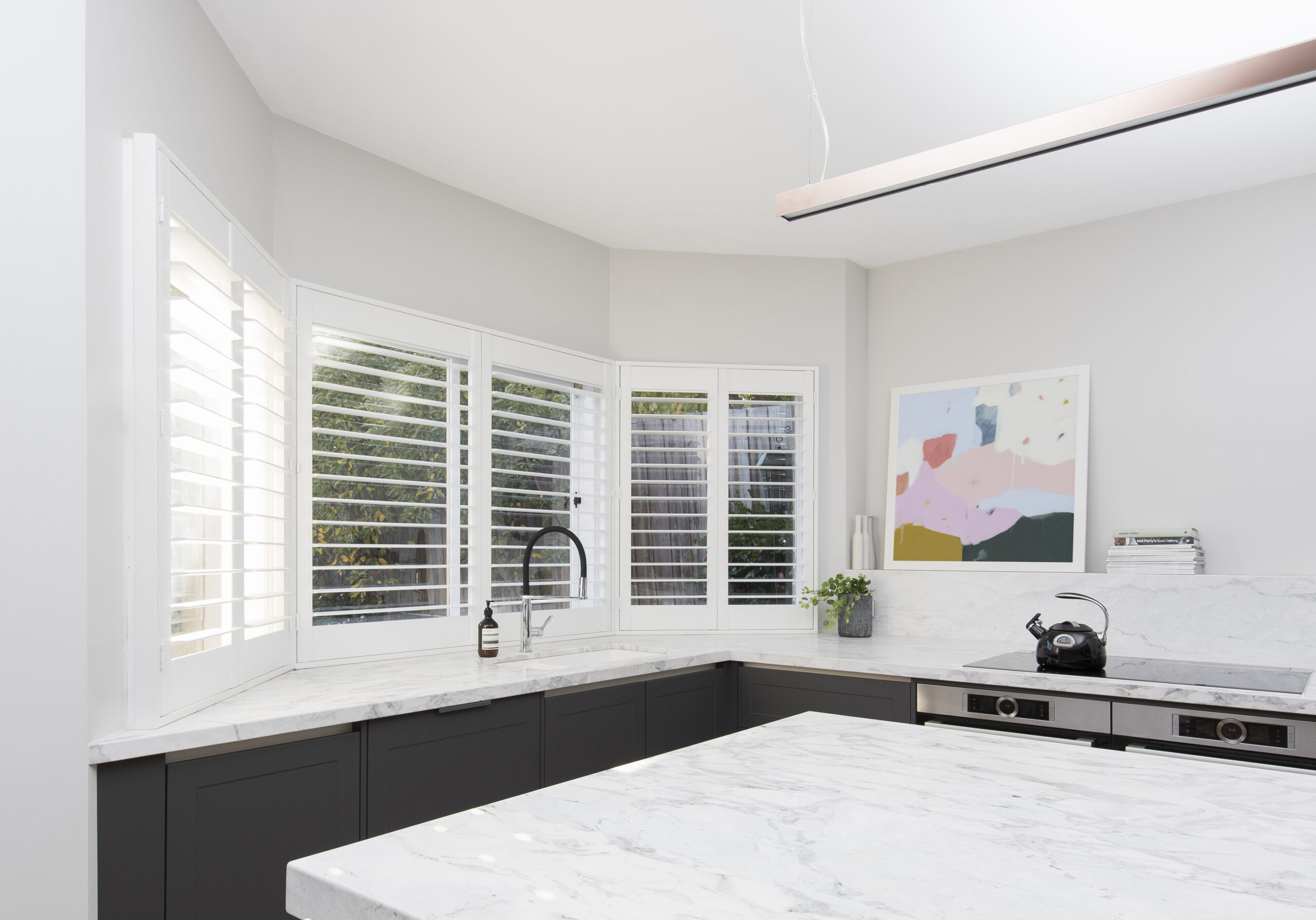
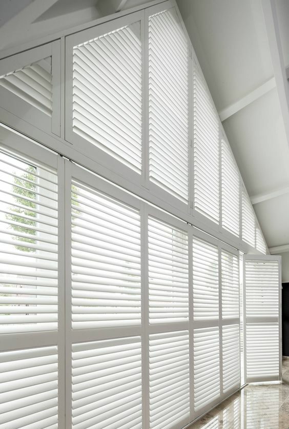
Plantation Shutters 101: Everything you need to know.
Plantation Shutters 101: Everything you need to know about picking the right Shutters for your home.
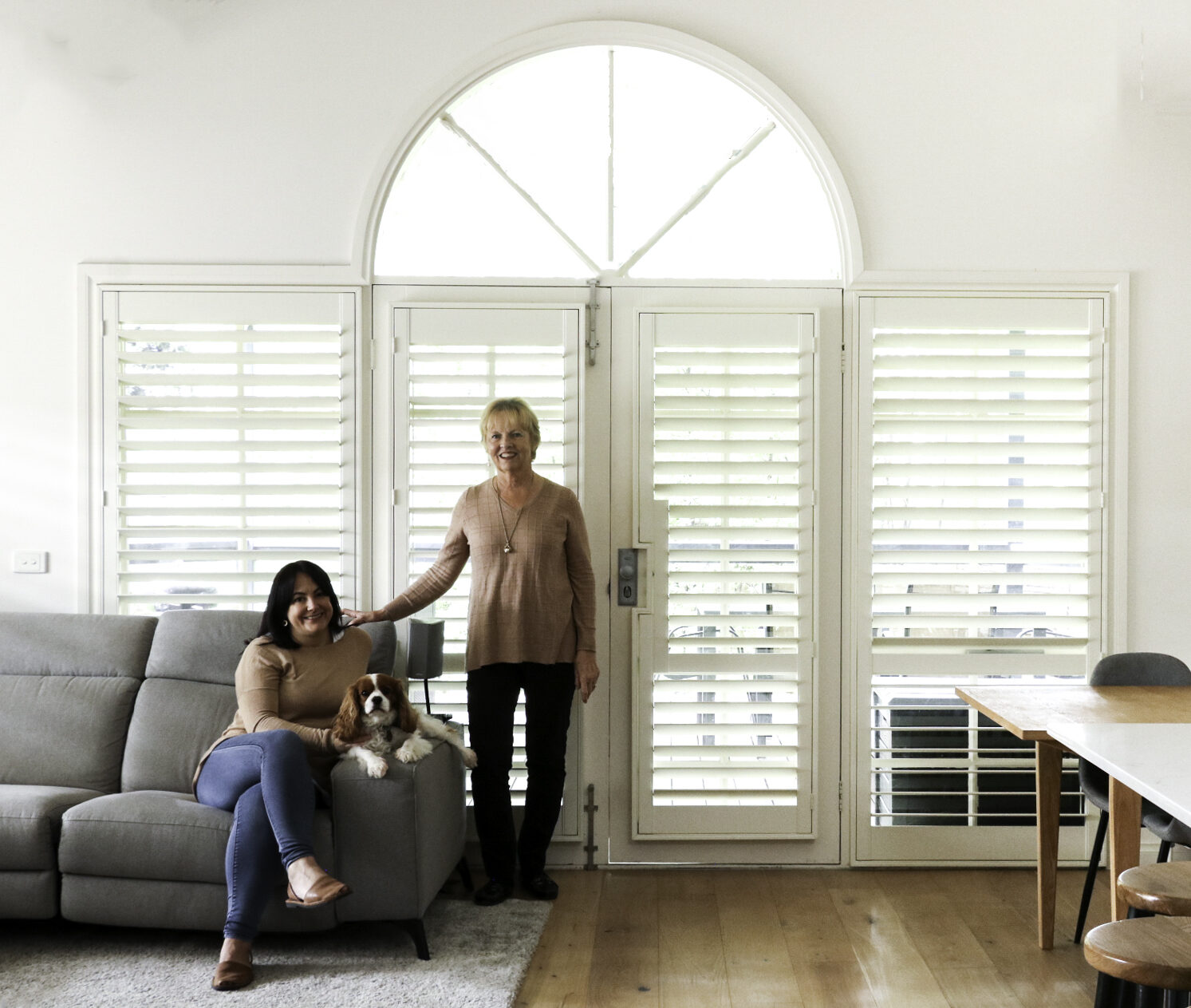
Kirsten + her Mother, Jenny.
Light control for a busy family is important. Lighter and brighter was our aim, so we have done plantation shutters on all windows throughout the house.
The Cox’s.
These Blinds certainly make life easy. We run off solar so being battery operated, we are charging batteries during the day.
Tulay.
My living room is literally on clouds! Wave Fold Drapes in Cloud make our living room heavenly.
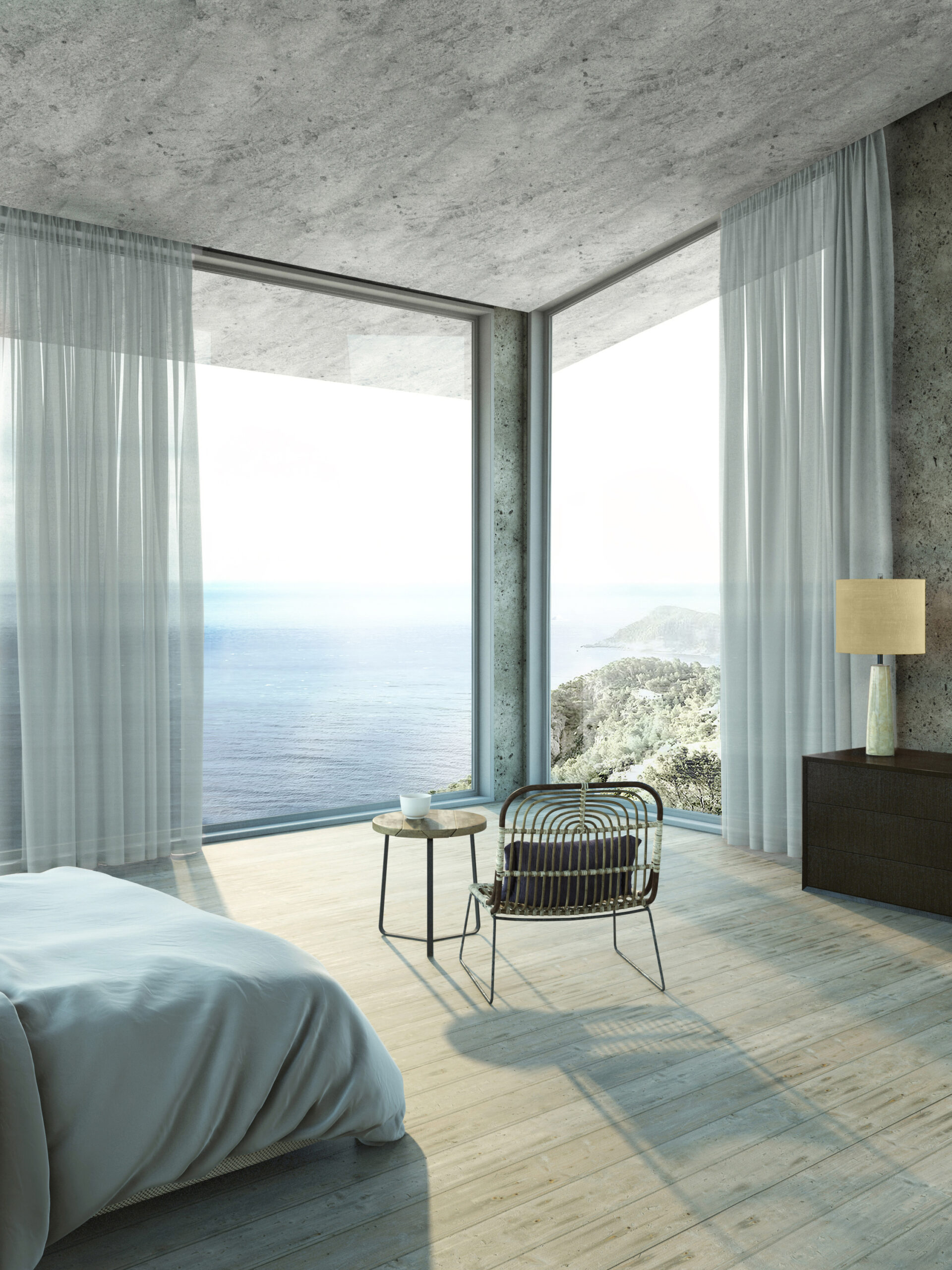
The perfect window covering for your corner window.
Going around the bend. Us too! Let us straighten you out and find the perfect window covering for your corner window.
Awnings, Outdoor Blinds + Shutters to create an outdoor living space.
Let’s eat out. Explore Australia’s largest range of outdoor window coverings.
Inside the studio with Warwick Fabrics.
We chat to Cam Warwick about the design studio of Warwick and discover how they bring innovation and style to the homes of Australia.
Continue reading.


As featured in.


