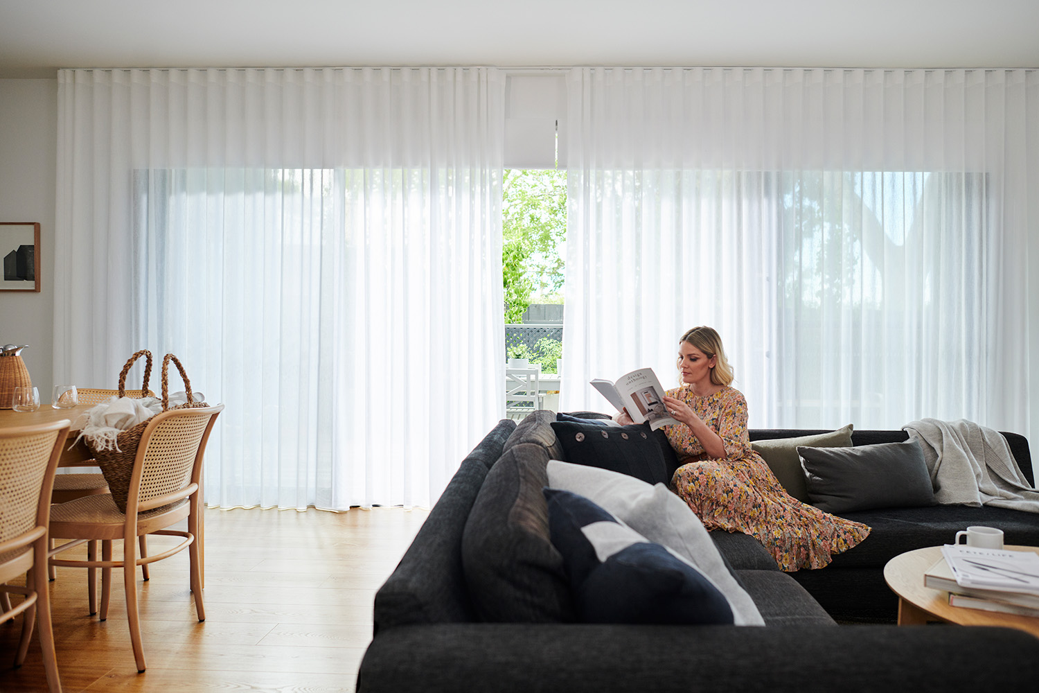
How to mix + match patterns like a pro.

Happy home. How to mix + match patterns like a pro.

Words by
Charles Parsons Interiors
Topic
Photography James Dunlop + Maurice Kain
Share

“To find the balance between matchy-matchy and clashing, it's all about choosing an overarching colour palette.”

— Justina Blakeney. Interior Stylist

Dont shy away from prints + patterns.

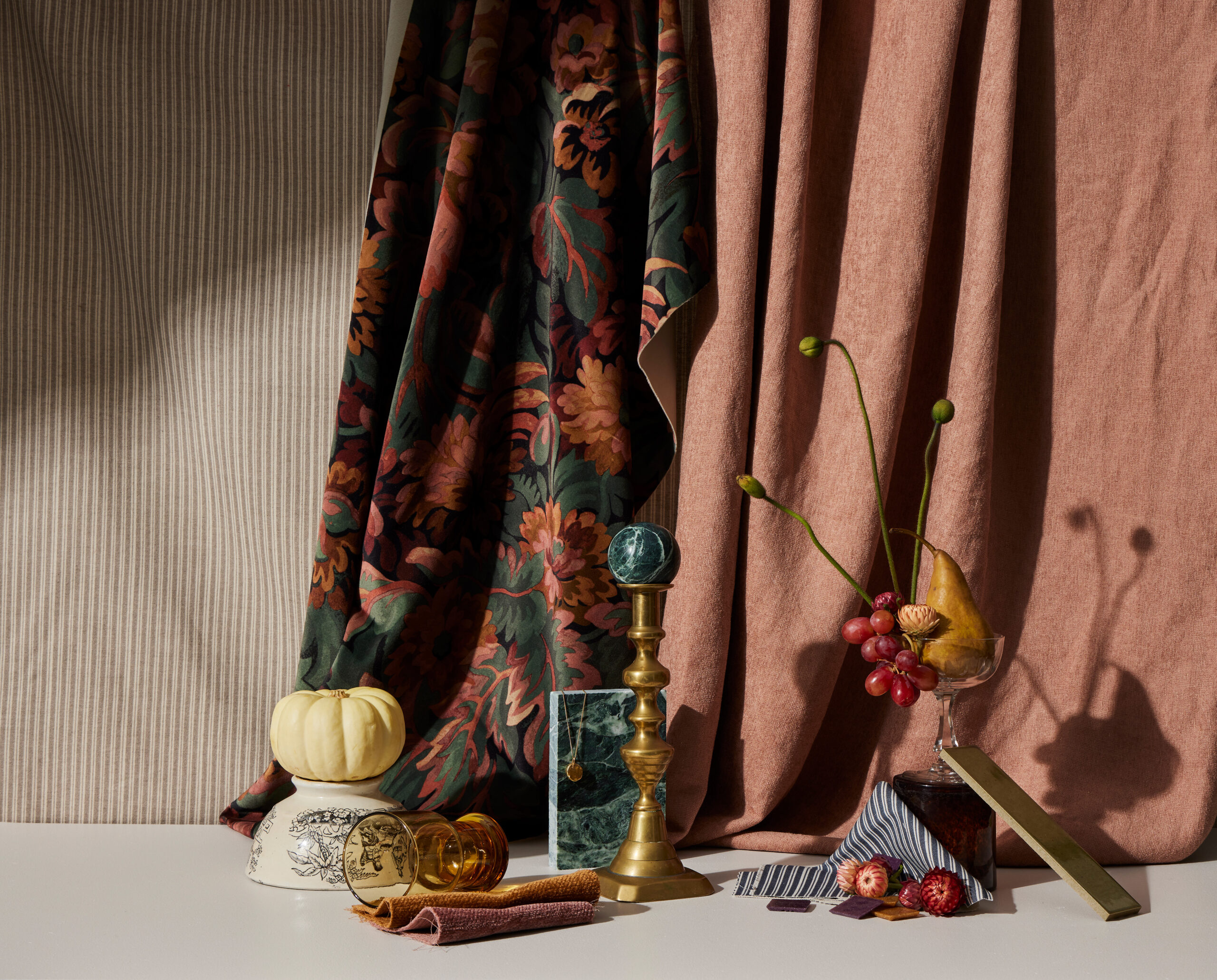
While it may seem less of a risk to stick to a neutral colour scheme or monochromatic palette, prints and patterns have the power to completely transform and elevate a space into a chic interior. It’s simply a matter of carefully and tastefully curating the patterns so they work seamlessly together in a complementary manner.


It can be tricky to master mixing and matching patterns. Many interior designers hone these skills over the length of a career, while others have an instinctive, natural aptitude for pairing prints.

No matter which end of the spectrum you find yourself there are universal tips and tricks to succeed in this styling process. Here are a few backed by industry professionals.
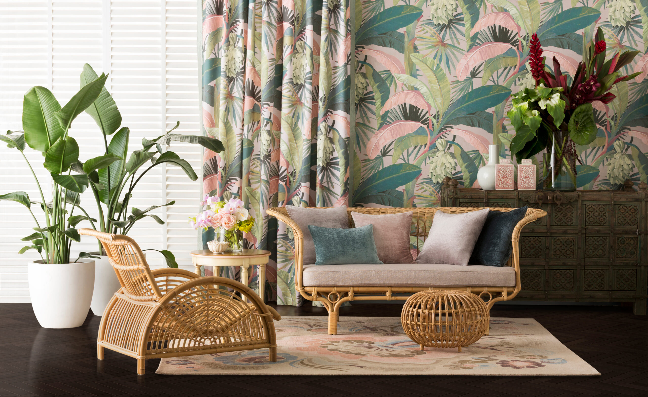
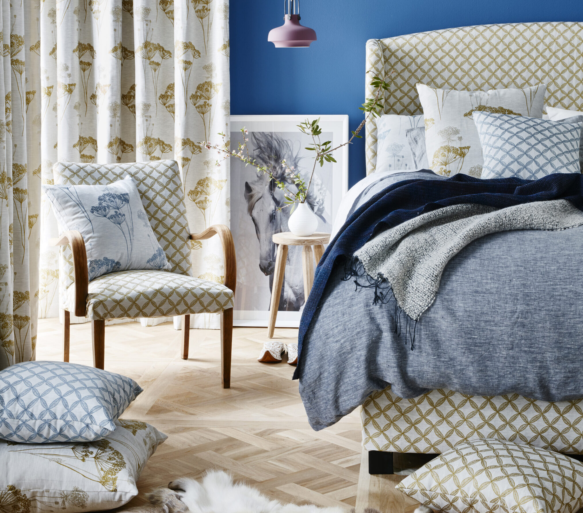
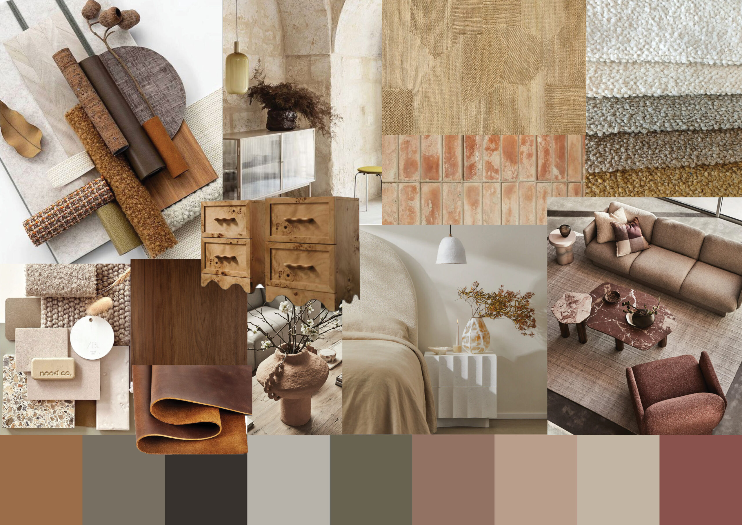
Tip 1: Rely on a cohesive colour palette.

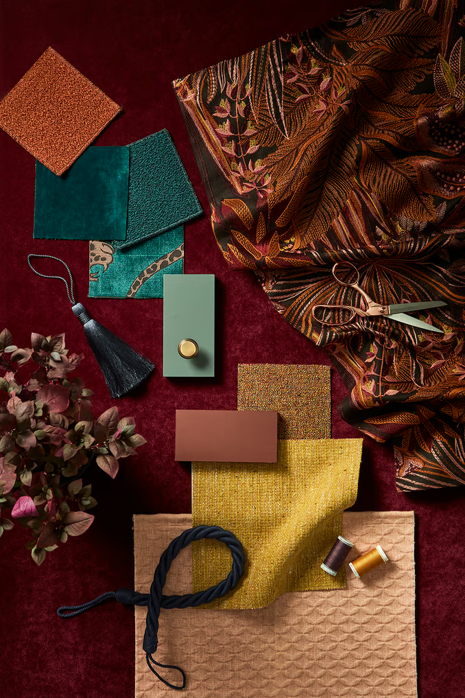
“To find the balance between matchy-matchy and clashing, it’s all about choosing an overarching colour palette,” suggests interior stylist Justina Blakeney in an interview with Architectural Digest.


As the author and owner of the popular Bohemian-inspired blog, The Jungalow, Blakeney relies on the use of a single colour to tie the patterns together. This doesn’t mean you have to pick the same hue but varying light and dark tones of the same base colour will also work harmoniously with the diverse patterns.

Tip 2: Choose a classic pattern across multiple surfaces.

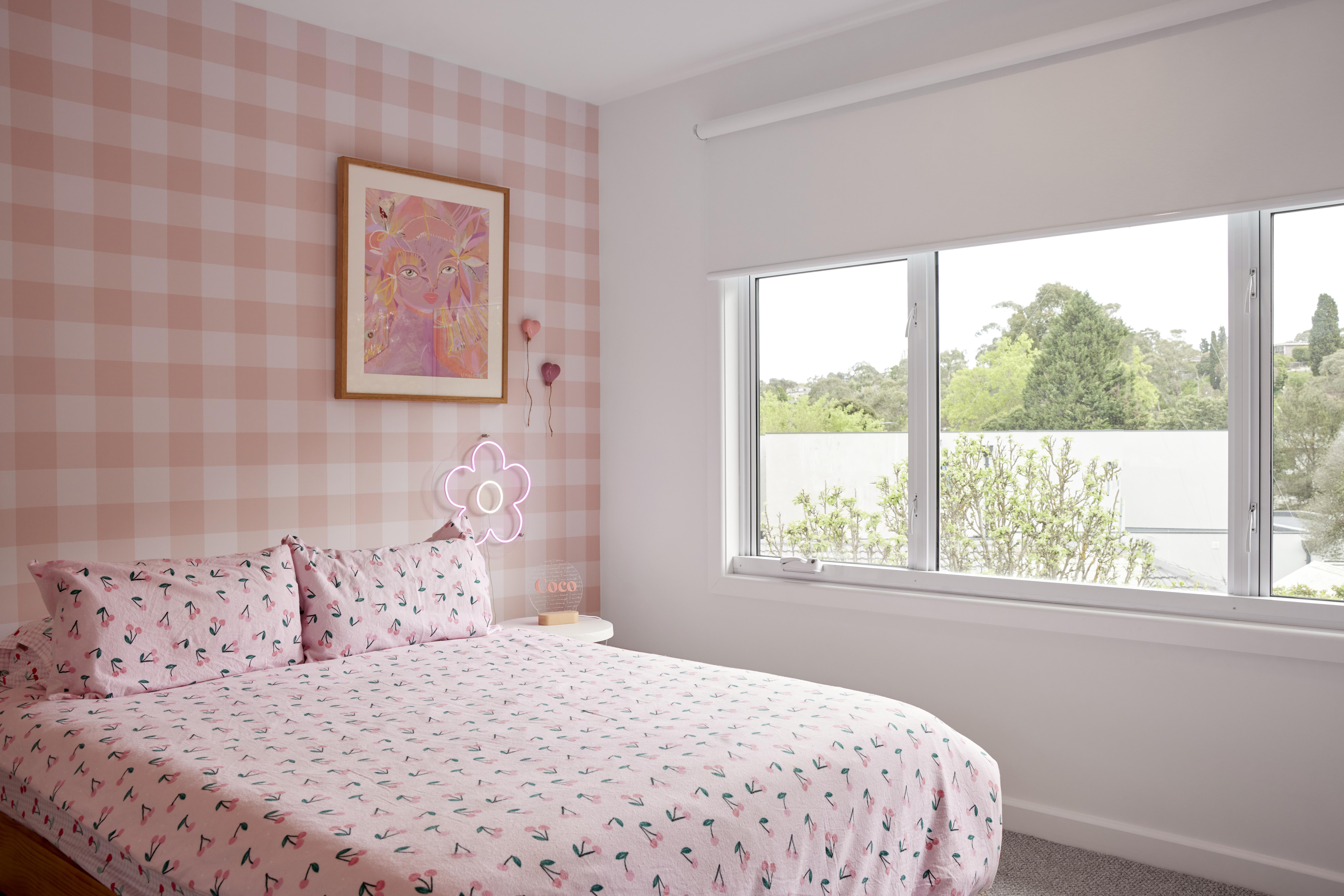
Classic patterns, such as stripes, polka dots or chevron, are timeless and have been used decade after decade in interior design.The bonus of these tried-and-tested patterns is that you are likely to find them in a wide range of surfaces, not just commercial textiles.


Artworks for your walls, ceramic vases, candle stands, rugs, throws and even lamp shades can be found decorated with striped, dotted or chevron patterns. This means you can layer the patterns throughout the room, choosing the same print but in different thicknesses or fading aesthetics.


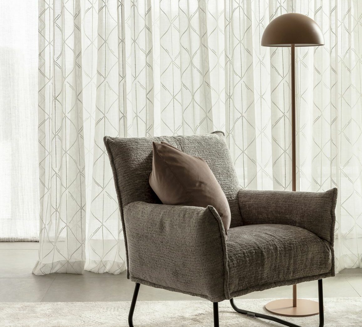
A chevron print can be brought out through a modern, abstract artwork for the wall as well as a crisp upholstery fabric in cushions. The triangular forms can then be echoed by a statement pendant light fixture. Sheer Curtain drapery can then tie everything together to bask a room in light, showcasing a chevron pattern in all its glory.

Tip 3: Use scale to your advantage.

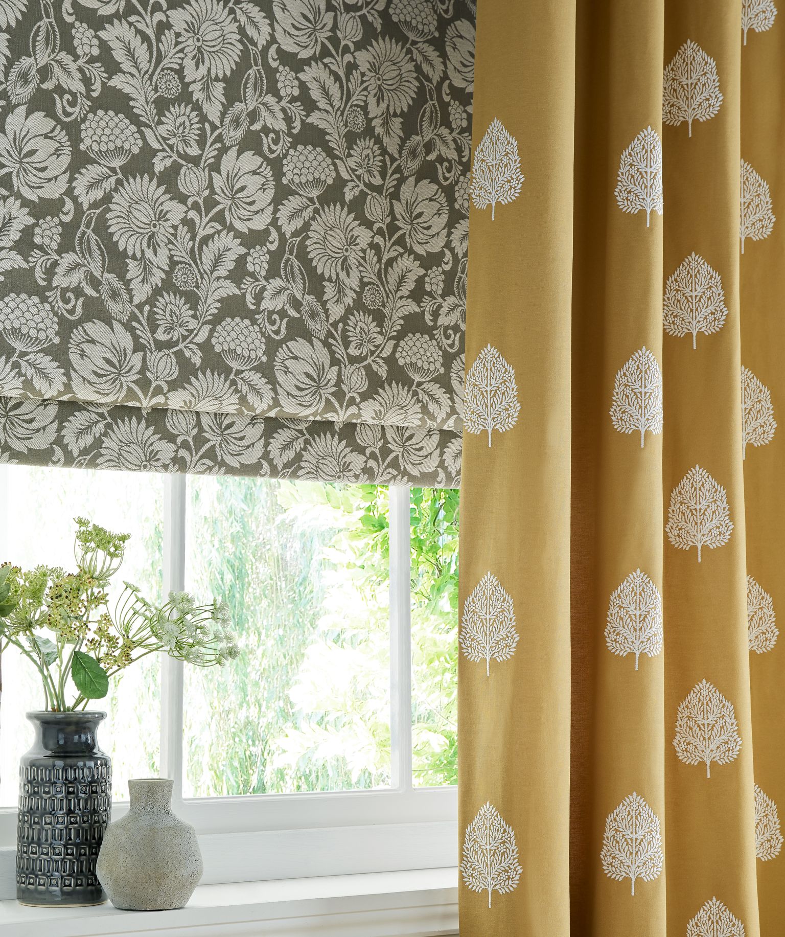
Interior Design Pro suggests playing with the scale of patterns, experimenting with big and bold patterns beside small and delicate prints.


Although there is no strict rule of thumb, most professionals will recommend not going beyond three to four different patterns when dabbling in scale as any more could become jarring and overwhelming.

Tip 4: Balance strategically with neutrals.

It helps to soften prints and patterns with solid neutrals. In an interview with House Beautiful magazine, designer Ashley Whittaker shared her top advice on how to strategically use solid neutrals to your advantage.

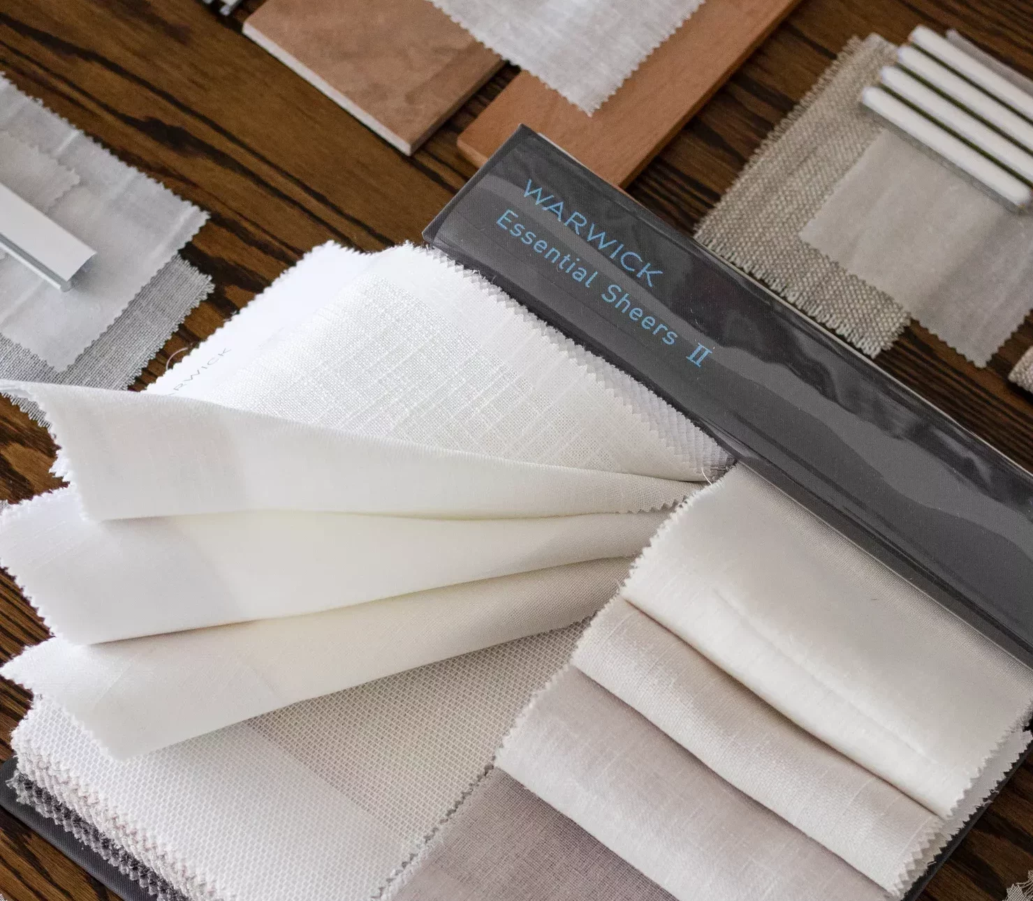
“I always tell clients not to be scared of pattern,” said Ms Whittaker. “They’ll look at six-by-six-inch swatches tightly clustered on a table and say, ‘ooh, wow… that seems like a lot.’ Of course I intersperse them with solids and neutrals.”

For interspersing your prints stock up on versatile neutrals such as cream, beige, brown, grey, white or black commercial textiles.

Tip 5: Choose prints or patterns that match the style of your home design.

Is your interior decor more contemporary, sleek and modern or antique, vintage and rustic-chic? Patterns and prints will also fall into these two spectrums of style, with some more futuristic and modern while others nod to the past with ornate, intricate line work.

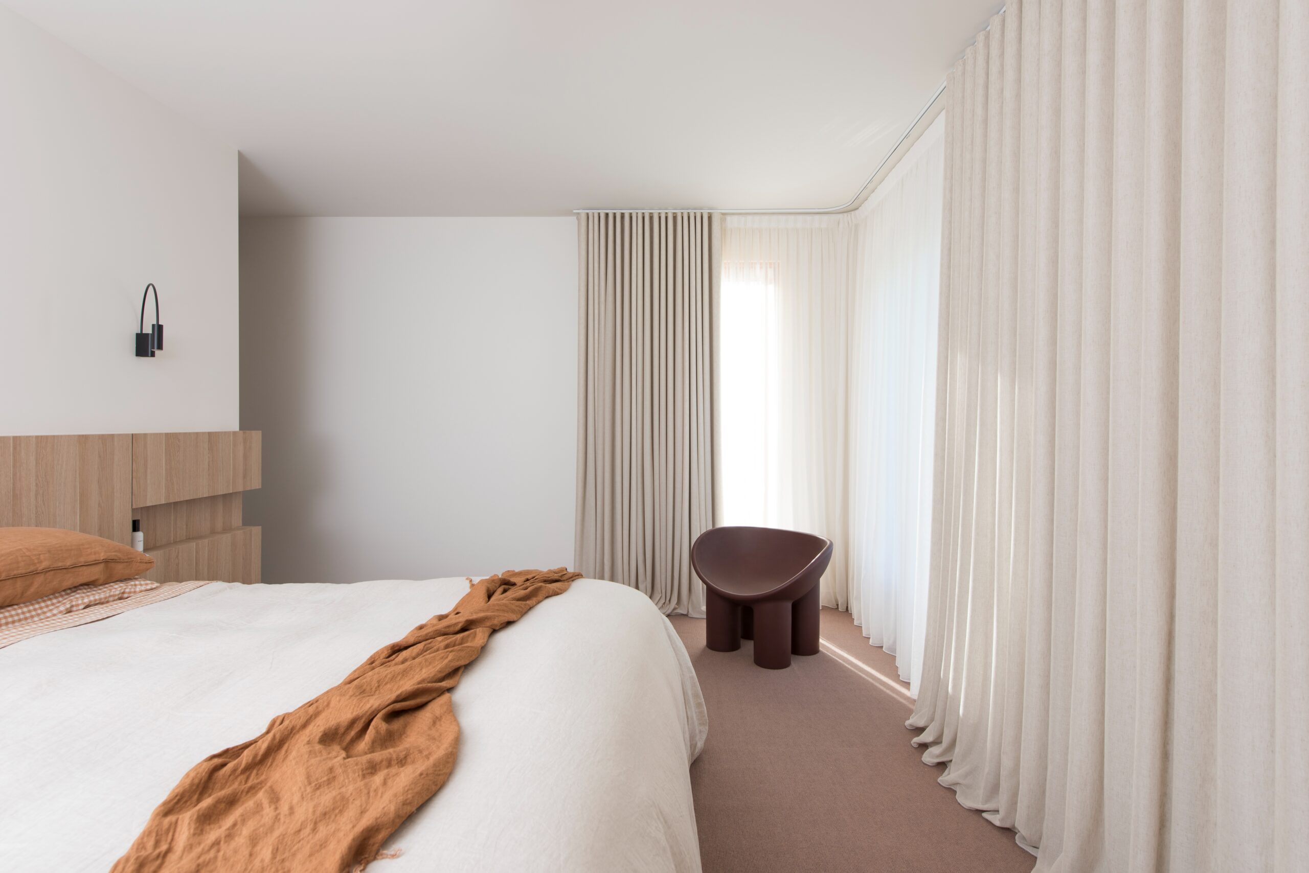
The trick to succeeding with a modern scheme is to prioritise block colours and solid upholstery fabric, in keeping with the minimalism vibe, but to introduce one standout feature print. The sofa, rug, cushions and furniture can all be in single colours in block materials with not a single pattern anywhere in sight. Then add a feature fabric in your window furnishings with a bold print to tie into the rest of the decor by keeping the same overarching colour scheme but it easily stands out from the rest of the room thanks to the pattern.

On the other hand, a bohemian vintage look will clutter and clash as many different earthy, organic prints such as leaves and plants in contrast with bold, vibrant colours. Both looks have their own value and impact so choose your own preference.

dollar curtains + blinds has specialised in crafting custom made window coverings in Melbourne for over 50 years. Contact us today, visit a store or book a free design, measure and quote. Our Interior Consultants can help you to make the perfect choice.

Need help?
For expert advice
call 03 9237 1200.

Professionally Installed Window Coverings
30+ Window Covering Stores
Australia's Largest Range of Window Coverings
Value Window Coverings
Free Design + Measure + Quote

Continue reading.