Styling neutrals with Helen Powell.
Styling neutrals with Helen Powell.

| Topic | Designer Tips |
| Photography | Louvolite + Helen Powell |
| Share | Email Facebook Pinterest |

“Done well neutral colour schemes are timeless, elegant, soothing and inviting, providing a pleasingly quiet backdrop for our busy modern lives.”
— Helen PowellLeading interiors and design writer Helen Powell, founder of Design Hunter knows a thing or two about styling with neutrals. We’ve asked Helen to give us some insight into what has become one of the most sought-after ways to style the contemporary home.
Neutral shades like grey, beige, taupe and oatmeal are an enduringly popular choice for modern pared back interiors. With a myriad of subtly different options to choose from neutrals can work with pretty much any style of décor, in either a period property or a contemporary setting.
I personally just find them easier to live with – I love the gentle sense of calm they can imbue into a space. Done well neutral colour schemes are timeless, elegant, soothing and inviting, providing a pleasingly quiet backdrop for our busy modern lives. Getting them right isn’t always as easy as people assume though. Hastily put together without proper consideration and attention to detail they can sometimes end up looking a little plain and uninspiring.
If you’ve settled on a soft neutral palette for your home and want to ensure that you add enough detail and interest to really bring the space to life here are some simple guidelines to follow.
Let’s Begin.
Start with what’s already present.
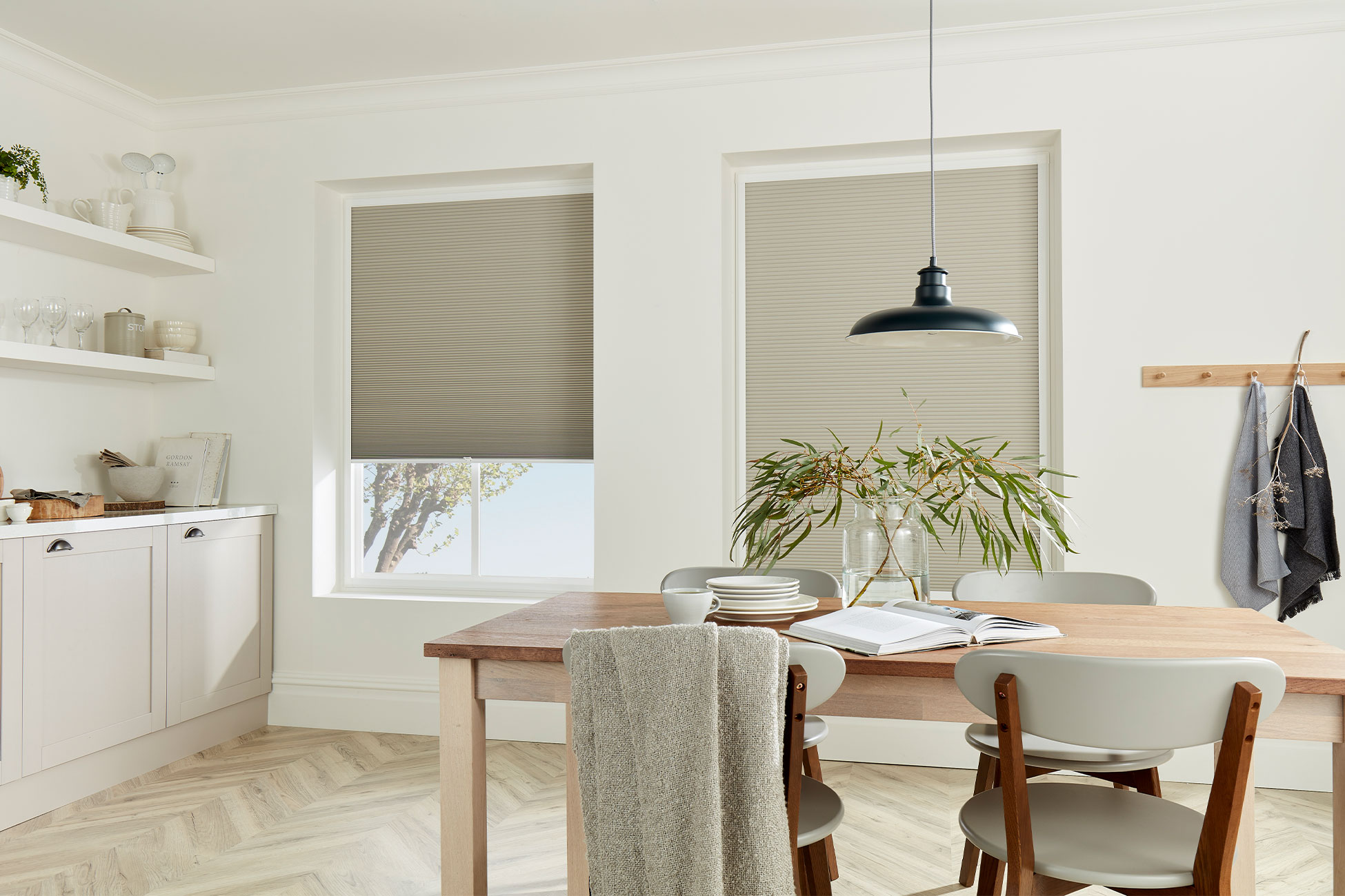
Window dressings are usually one of the last elements to be added to a space, often after more fixed items like flooring or kitchen cupboards or worktops have already been chosen, so when choosing blinds take your cue from what’s already in place, as well as from the architectural features of the space.
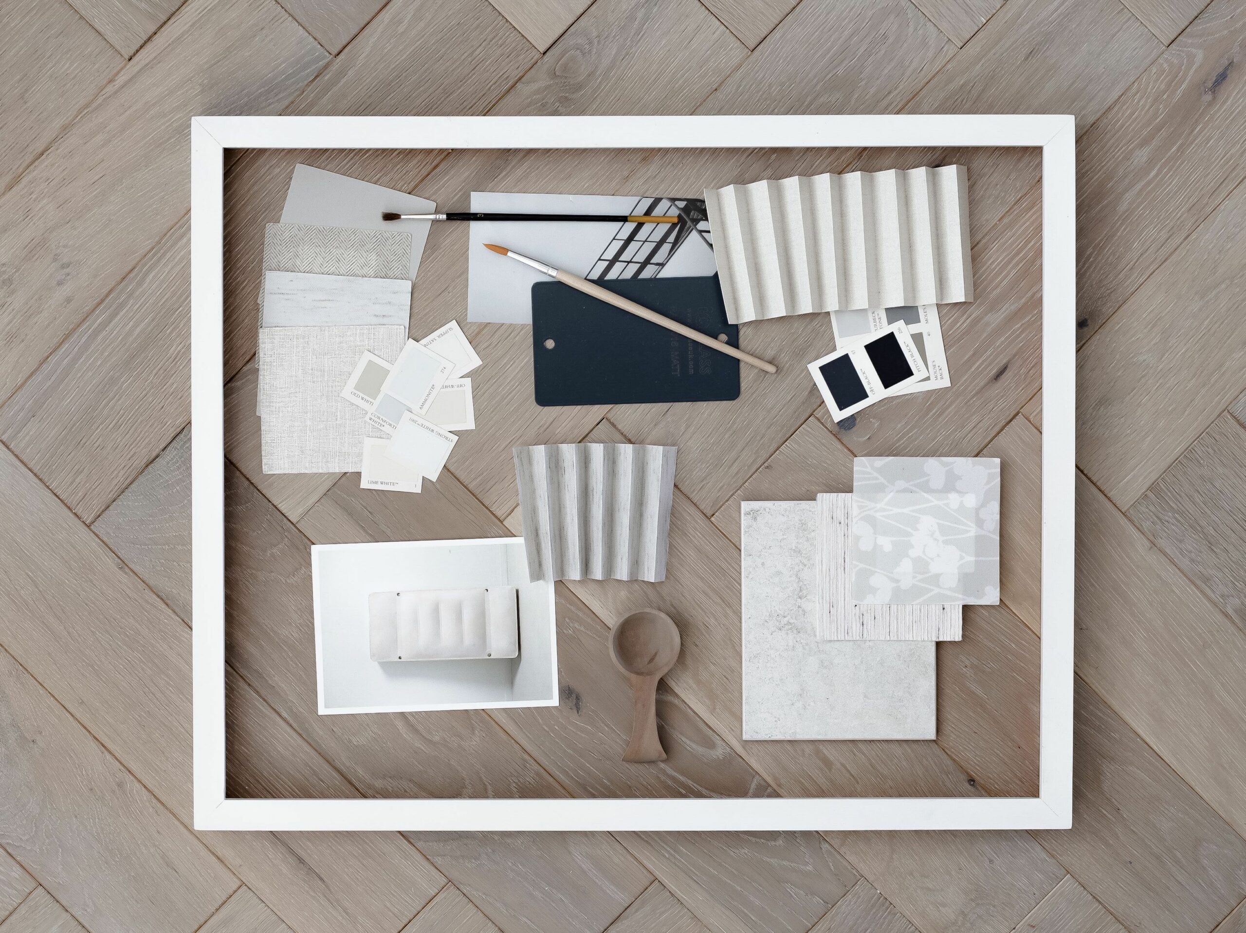
Mood board curated by Helen Powell
Start by creating a mood board with some of the materials and colours you already have in the room. In the mood board below, the key elements I’ve included are the light oak herringbone floor, the black metal accents and the worktop sample. Once I had these in place I then played around with different fabric and paint swatches to come up with a range of options that would work together.
-
Choose tones that work together harmoniously.
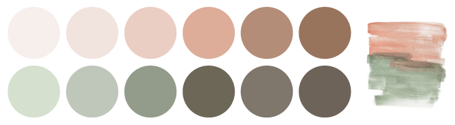
Not all neutral colours are the same, so when putting together a colour palette based on them the first thing you need to consider is their underlying tone. This could be red, yellow, grey, green or lilac based. Cooler neutrals with grey or lilac undertones can be used to create a clean urban or architectural feel while those with green undertones will often feel more traditional. Think about the look you want to create and then choose colours that share a common undertone as these will usually harmonise with each other more easily.
Introduce different textures.
This is the one design guideline I always adhere to when I’m decorating with neutrals. The more different textures you include the more interest you will add to the space.
-
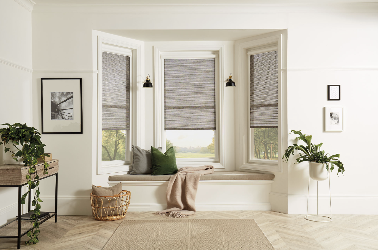
Consider your focal point.
- Here, it’s the bay window and the window seat, but in a different space it could be a fireplace, a set of patio doors or an unusual piece of art or furniture.
The roll up Blinds allow for an uninterrupted view out from the window seat but can be pulled down for privacy when needed. It’s worth noting that the colour of the Blind is darker than the rug and the window seat – the fabric actually has a subtle black stripe. This provides tonal contrast and creates a more interesting dynamic than if it had exactly matched the other soft furnishings. It also ties in with some of the other black accents in the room.
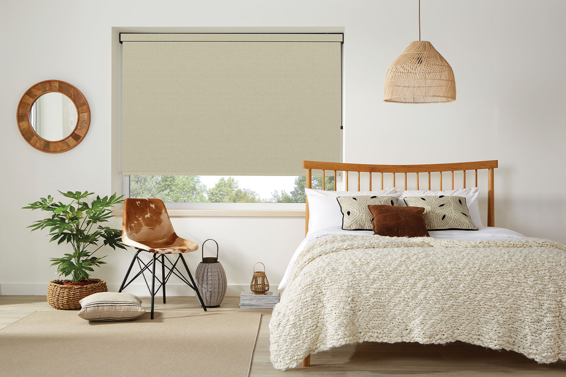
Natural materials will usually work better than synthetic materials with this type of restrained neutral palette because understated colours tend to push the focus onto the quality and finish of the materials. Consider using unbleached linens, limestone flooring, wood with a natural unfinished look, cotton velvets, leather, wool, marble, rattan and rough textured stoneware ceramics to add depth and richness.
-
Make a statement with art + accessories
You can go bold or subtle here. A muted stripe or herringbone on the window treatments will add soft visual detail without overpowering the other elements within the room. For something a bit bolder try a striking geometric pattern on a cushion or throw.
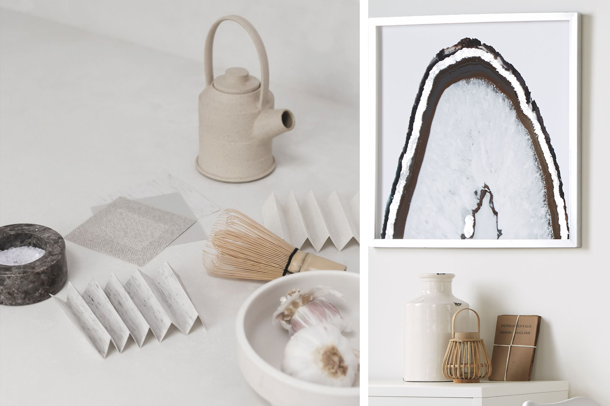
Accessories styled by Helen Powell
-
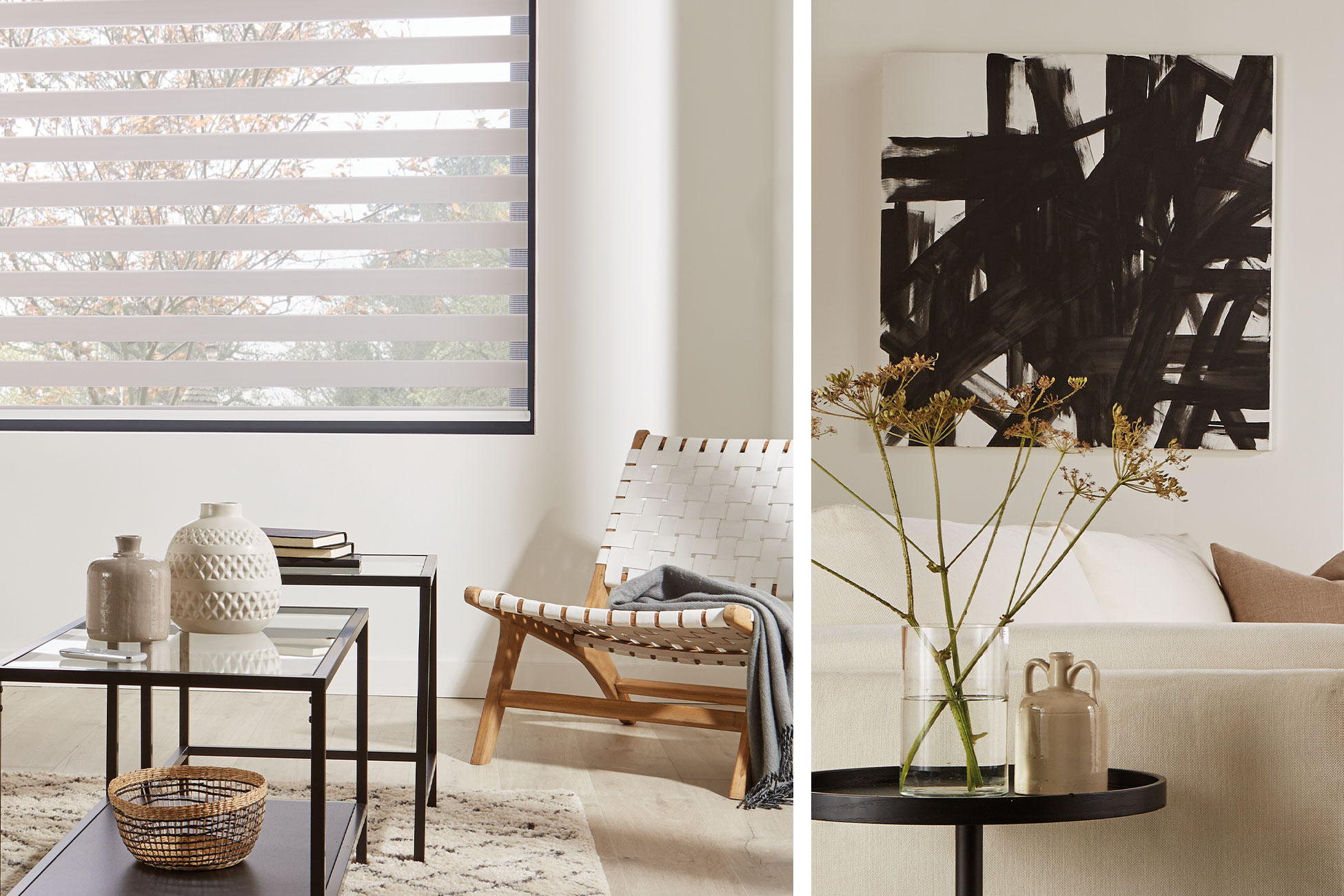
Add a touch of pattern.
Neutral colours are inherently quiet and calming, but if you are working with this type of understated colour palette it’s a good idea to introduce a different dynamic somewhere within the space or it can end up feeling a little stagnant. Here that’s provided by the art, but it could be a rug, an unusual piece of furniture or a statement light.
-
Choose darker accents to contrast + complement.
If you’ve done all of the above and still feel there’s something missing, try adding a few black accents. Black provides depth and definition and instantly anchors everything. Choose a black metal coffee table, black light fittings or black door handles – the possibilities are endless.
Love this? Discover more from Helen Powell at Design Hunter.
Design Hunter was founded by interiors writer and stylist Helen Powell in 2009. Since then, it has become one of the UK’s leading interiors, design and lifestyle blogs, reaching thousands of readers every month and has been featured in publications including The Sunday Times, Elle Decoration, Domino, The Independent and Good Homes.
dollar curtains + blinds has specialised in crafting custom made window coverings for over 50 years. Contact us today, visit a store or book a free design, measure and quote. Our Interior Consultants can help you to make the perfect choice.

")
")


")
")
