Colour Trend Forecast 2026 – with James Dunlop Textiles.
Explore the 2026 Colour Trend Forecast with our design partner, James Dunlop Textiles. This blog identifies three trending colour palettes, set to develop in interest over the coming year.
Words by
dc+b editor
| Topic | Designer Tips |
| Photography | James Dunlop Textiles |
| Photography | dc+b |
| Share | Email Facebook Pinterest |


 (1)")

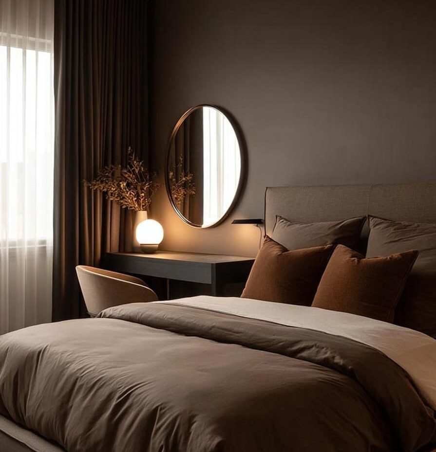
Complex Darks.
Dark, moody shades continue to grow in popularity across soft window furnishings, bringing depth and drama to interior design. Familiar tones like burgundy, martini green, and chocolate brown are now joined by nuanced washes of eggplant, mustard, and royal blue, creating layered, sophisticated palettes.
Complex Darks are made for richness and dimension, yet are freshened by optimistic accents in imperfect plum and cherry pink, as effortlessly as pops of yellow, cobalt, or clean Copenhagen blue, adding vibrancy and contrast to the fabric.
Leafy, deconstructed florals and distorted tapestry-inspired patterns also play a role in this palette, reflecting a biophilic influence that adds texture, mystery, and subtle complexity to furnishings. These patterns evoke depth while maintaining a sense of ambiguity, making them perfect for Curtains that elevate a space without overwhelming it.
")

Like the dark and moody look?
To incorporate the Complex Darks palette into your interior, consider adding our designer Double Curtains, pairing heavier Blockout Curtains in moody shades with lighter Sheer Curtains to create depth, drama and control over natural light.
Textured fabrics such as velvet or jacquard add an extra layer of tactile richness, enhancing the mood while elevating the overall look and feel of the space.
Patterned or subtly distressed designs can become statement pieces in living areas or bedrooms, while still harmonising with the surrounding décor. This palette ensures that your window coverings become both a focal point and a cohesive element, bringing warmth, sophistication, and personality to every window.
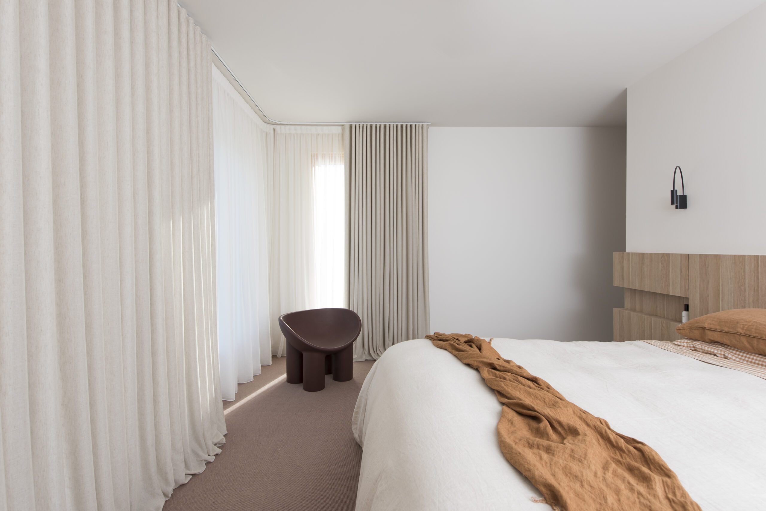
Near Neutrals.
The design community has increasingly moved away from stark, minimalist whites, favouring warmer tones such as calico, ivory, and spiced shades of terracotta, cinnamon, bronze, sienna, buff, and soft peach. Subtle touches of blush pink, celadon, and duck egg provide gentle contrast, occasionally offset by livelier accents of acid green or ochre, creating a nuanced palette that feels fresh yet grounded.
While these hues are genuine colours in their own right, within our interiors they function as foundational neutrals, offering a versatile base for layering texture, celebrating craftsmanship, and embracing the comfort of the handmade.
Dimensional upholsteries, open-weave draperies, and irregular, gestural patterns allow these colours to be introduced with confidence, providing personality without overwhelming the space. Passive patterns and biophilic influences integrate seamlessly with this palette. Tonal representations of foliage and organic motifs, subtle enough to blend into their surroundings, encourage calm and relaxation, offering the restorative benefits of nature without relying on overtly literal imagery.
")

Bring Near Neutrals into your home.
Near Neutrals can be beautifully incorporated into interiors by layering Blockout Curtains in warm ivory or terracotta tones with textured Sheer Curtains. This combination adds depth while allowing light to diffuse gently throughout the room.
Soft furnishings in open-weave fabrics, subtle patterns, or hand-finished textures bring warmth and tactility to interiors, while tonal colour layering across Accessories ensures a cohesive, comforting, and sophisticated scheme. This approach allows homeowners to enjoy the understated richness of the palette while maintaining flexibility for accenting with bolder colours when desired.

")

For Kimmy Hogan, she believes that art, natural light, and a warm palette makes her house feel like a home. She opted for our Sheer Curtains with a beautiful linen look in a natural tone, bringing a warm and inviting feel to her space.

")
“Our Sheer Curtains are so beautiful and add so much warmth and life to the space. They completely transform a boring room into something luxurious and warm. ”
— Kimmy Hogan

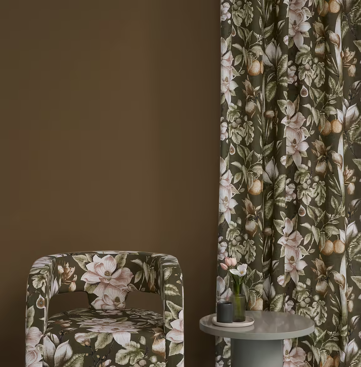
Antique Pigments.
We are seeing the rise of a nostalgic, time-worn palette that draws inspiration from fashion runways and cinematic worlds alike. Echoing the textures of peeling paint, fading velvet, and mellowing frescoes, the Antique Pigments palette conjures the romantic charm of once-grand residences in gentle decline.
Colours historically derived from stones, plants, and creatures, transformed into powders, paints, and dyes — reappear here as rich, layered shades of oxblood, mustard, ochre, russet, lapis, and indigo. These vintage tones, reminiscent of ancient alchemy, are never harsh or confronting; instead, they offer a warm, approachable sense of history and depth.
Patinaed and hammered metals in warm bronze or rose gold complement these hues beautifully and can be echoed in textiles through stainless steel yarns, jacquard velvet weaves, or metallic inks. Mid-scale patterns add sophistication to traditional motifs, highlighting the soft, imperfect edges of handcrafted design to create interiors that feel thoughtfully curated rather than fussy.


Adding Antique touches.
Incorporating Antique Pigments into interior style creates an immediate sense of warmth, character, and texture. Curtains in velvets, jacquards, or subtly metallic fabrics can frame windows with rich, layered colour, while open-weave or textured Sheer Curtains soften light and complement the aged, lived-in aesthetic.
Layering patterns and tones across multiple window furnishings allows the palette to express depth and sophistication, turning each window into a focal point that balances history, craftsmanship, and contemporary elegance.
“Eclectic style is about mixing elements from different periods and styles to create something that is uniquely yours.”
— Miles Redd, Interior DesignerBring these colour trends to life.
Feeling inspired, but unsure where to begin?
Let our expert team of Interior + Exterior Consultants guide you through it all!
Find your nearest store today and reach out for personalised assistance in aligning our fabrics and products with your desired interior style. Alternatively, book your free measure + quote today.
")
")
")


")
")

